
- Publisher |
- Enrico Bertini and Moritz Stefaner
- Media Type |
- audio
- Podknife tags |
- Data Science,
- Interview,
- Technology
- Categories Via RSS |
- Arts,
- Education,
- Technology,
- Visual Arts
- People |
- Country Of Origin |
- USA
- Produced In |
- New York, NY
- Premiere Date |
- 2012-02-14
- Related Hashtags |
- #dataviz
- Frequency |
- Biweekly
- Explicit |
- No
This podcast currently has no reviews.
Submit Review

Related episodes

We have Vidya Setlur on the show to talk about the role language, and natural language processing (NLP) play in data visualization and analytics.
Vidya is the director of research at Tableau and has a background in natural language processing and visualization. She is one of the main drivers behind Eviza, a research-based prototype and the corresponding product Ask Data, developed within Tableau to interact with data visualizations through natural language.
She is also the co-author, with Bridget Cogley, of Functional Aesthetics for Data Visualization, a new book on data visualization with a lot of information about semantics and language in data visualization.
In the episode, we talk about the challenges of going from a research prototype to an actual product, research vs. engineering, speech and natural language interfaces, the many ways language plays a role in visualization, the advent of language models, and much more.
Enjoy the show!
Links
- Winners of Information is Beautiful Awards
- Book: Functional Aesthetics for Data Visualization
- Paper: final.pdf">Automatic Generation of Semantic Icon Encodings for Visualizations
- Paper: A Linguistic Approach to Categorical Color Assignment for Data Visualization
- Eviza: A Natural Language Interface for Visual Analysis
- Paper: Snowy: Recommending Utterances for Conversational Visual Analysis
—
Remember: our podcast is listener-supported. Please consider donating using Patreon or Paypal. Thanks! 
Related episodes

Links
- IEEE Vis ’22
- Our guest: Tamara Munzner
- VIS Keynote: Marti Hearst – Show It or Tell It?
- VIS Capstone: Kerry Magruder – Galileo’s Telescope Discoveries: Thinking Visually in the History of Science
- workshop.github.io/about.html">Keynote BELIV workshop: Casey Fiesler – Data Is People, Research Ethics Beyond Human Subjects
- VAST 10 Year Test of Time Award: EnterpriseAnalysisInterviews-VAST.pdf">Enterprise Data Analysis and Visualization: An Interview Study
- InfoVis 10 Year Test of Time Award: Design study methodology: Reflections from the trenches and the stacks
- Paper: HiTailor: Interactive Transformation and Visualization for Hierarchical Tabular Data
- Paper: Dashboard Design Patterns
- Book: AK Peters Visualization series
- Paper: VegaFusion: Automatic Server-Side Scaling for Interactive Vega Visualizations
- Paper: Plotly Resampler: Effective Visual Analytics for Large Time Series
- Paper: Visualizing Graph Neural Networks with CorGIE: Corresponding a Graph to Its Embedding
- alt.VIS workshop
- Jo Wood’s visual essay “Beyond the Walled Garden“
- Paper: Affective Learning Objectives for Communicative Visualizations
Related episodes
- from Visweek 2012
- IEEE VIS'13 Highlights w/ Robert Kosara
- IEEE VIS'14
- Tamara Munzner
- IEEE VIS’15 Recap with Robert Kosara and Johanna Fulda
- Highlights from IEEE VIS'16 with Jessica Hullman and Robert Kosara
- Review of IEEE VIS’17 with Jessica Hullman and Robert Kosara
- Highlights from IEEE VIS 2018
- Highlights from IEEE VIS'19 with Tamara Munzner and Robert Kosara
- Highlights from IEEE VIS'20 with Miriah Meyer and Danielle Szafir


In this new episode, we talk about the interplay between statistics and data visualization. We do that with Andrew Gelman, Professor of Statistics and Political Science at Columbia University, and Jessica Hullman, Professor of Computer Science at Northwestern University. Andrew started the popular blog “Statistical Modeling, Causal Inference, and Social Science,” which has an active community of readers and has been around for many years. Jessica started contributing lately with many exciting posts, several of which have to do with data visualization. In the episode, we touch upon many topics, including the story behind the blog, the role of surprises, anomalies, and storytelling in science, the Anscombe’s quartet, and exploratory data analysis.
Links
- Jessica Hullman: http://users.eecs.northwestern.edu/~jhullman/
- Andrew Gelman: http://www.stat.columbia.edu/~gelman/
- Blog: Statistical Modeling, Causal Inference, and Social Science: https://statmodeling.stat.columbia.edu/
- Andrew’s 2003 paper on visualization as model checks: “Exploratory Data Analysis for Complex Models”
- Jessica and Andrew’s follow-up article expanding on the idea of model checks for visualization research: “Designing for Interactive Exploratory Data Analysis Requires Theories of Graphical Inference”
- Andrew and Thomas’ paper on stories in social sciences: “When Do Stories Work? Evidence and Illustration in the Social Sciences”
—
Remember: our podcast is listener-supported; please consider donating Using Patreon or Paypal. Thanks!
Related episodes

Hey all, we are back!
In this episode, we have Amanda Makulec to catch up on what happened during this whole period of time.
Amanda is a public health and data visualization expert and she is the Executive Director of the Data Visualization Society.
In the episode, we talk about the Data Visualization Society, the new Information is Beautiful Awards (now organized by the DVS team), and how visualization has evolved lately.
Links
- and-beauty.net/projects/who">WHO Data Design Language
- and-beauty.net/projects/climate-and-conflict">Climate & Conflict Analysis for German Foreign Office
- Enrico’s FILWD Newsletter
- https://www.amandamakulec.com
- https://twitter.com/abmakulec
- https://www.datavisualizationsociety.org
- https://www.informationisbeautifulawards.com/awards/2022
- Frank Elavsky (A11y work in vis)
- Uncertainty visualization work (Jessica Hullman and Matthew Kay)
- Data Humanism (Giorgia Lupi)
- Moritz’s keynote at EUROVIS
- Crystal Lee’s work on how vis is used for covid19 communication
- Why Shouldn’t All Charts Be Scatter Plots? Beyond Precision-Driven Visualizations
- Joss Fong’s Automating Bias
- Warming stripes
—
Remember: our podcast is listener-supported, please consider making a donation! Using Patreon or Paypal. Thanks
Related episodes
The title says it all. Excited to reboot!

Visualization is a very powerful cognitive tool. I think we all agree with that. But what happens if a person is visually impaired or has other impairments that prevent them to fully benefit from it? It’s surprising, despite the huge success visualization had during these last few years, how little we have to show in terms of supporting this very relevant segment of the population.
To discuss this topic we have on the show Sarah Fossheim. Sarah is a full-stack developer and UX researcher with a specific expertise on accessible design for data visualization projects. See for instance their “How to create a screen reader accessible graph like Apple’s with D3.js“.
On the show, we talk about what is accessibility and what role it plays in data visualization, how to make charts and visual representations more accessible, and how to get started with accessible design.
This is a hugely important topic and we hope you will find some inspiration by listening to it!
Links:
- https://fossheim.io
- https://twitter.com/liatrisbian
- Chartability <https://chartability.fizz.studio>
- Dataviz Accessibility Resources <https://github.com/dataviza11y/resources>
- Outlier 2021—Are your visualizations excluding ppl?
- Writing Alt Text for Data Visualization
- Apple previews powerful software updates designed for people with disabilities
- Summarizing Information Graphics Textually
- Loud Numbers Podcast
- DS 075 | Listening to Data From Space with Scott Hughes
—
Remember: our podcast is listener-supported, please consider making a donation! Using Patreon or Paypal. Thanks
Related episodes

We have our friend Sandra Rendgen on the show to talk about the work of Edward Tufte. Tufte does not need any introductions of course. We discuss his early works and efforts, all the books he published, his contribution and legacy and the influence he had on our work.
Enjoy the show!
Remember: our podcast is listener-supported, please consider making a donation! Using Patreon or Paypal. Thanks
Links
- Impfdashboard <https://impfdashboard.de>
- Enrico’s ML vis work: Slice Lens <https://github.com/nyuvis/SliceLens>
- Observable notebooks for teaching <https://observablehq.com/collection/@nyuvis/guides-and-examples>
- Our guest: Sandra Rendgen <https://sandrarendgen.wordpress.com/>
- First book “The Visual Display of Quantitative Information” and how it influenced a lot of people <https://www.edwardtufte.com/tufte/books_vdqi>
- Second book “Envisioning Information” <https://www.edwardtufte.com/tufte/books_ei>
- Third book “Visual Explanations: Images and Quantities, Evidence and Narrative”<https://www.edwardtufte.com/tufte/books_visex>
- Fourth book “Beautiful Evidence” <https://www.edwardtufte.com/tufte/books_visex>
- Fifth book “Seeing with Fresh Eyes: Meaning, Space, Data, Truth“ <https://www.edwardtufte.com/tufte/seeing-with-fresh-eyes>
- Robert Kosara’s review of Tufte’s workshops <https://eagereyes.org/criticism/edward-tufte-one-day-course>

Links
- Svelte tutorial
- svelte.recipes
- Svelte Radio
- Mathias Stahl: How you setup data visualization with Svelte
- Layercake
- “I am a book. I am a portal to the universe.”
- tec-c4-extra-fine-tip.html">Pilot G-Tec C4
- https://www.madefromdata.com/products
- https://frontendmasters.com/courses/d3/
- https://frontendmasters.com/courses/svelte/
Remember: our podcast is listener-supported, please consider making a donation! Using Patreon or Paypal. Thanks
Related episodes


Hey all, we are back! In this classic episode we go over highlights from the IEEE VIS’20 conference. We cover a broad set of themes with Danielle Szafir from University of Colorado and Miriah Meyer from University of Utah, who helped us explore latest trends in visualization. See the main links and details in the show notes below. There is a lot to explore!
Remember: our podcast is listener-supported, please consider making a donation! Using Patreon or Paypal.
Links
Topic: IEEE VIS conference <http://ieeevis.org/year/2020/welcome>
Miriah Meyer <http://www.cs.utah.edu/~miriah/>
Danielle <https://danielleszafir.com>
PolicyViz episode on IEEE VIS 2020: <https://policyviz.com/podcast/episode-184-ieeevis-recap/>
Short paper: Why Shouldn’t All Charts Be Scatter Plots? Beyond Precision-Driven Visualizations: <https://arxiv.org/abs/2008.11310>
John Burn-Murdoch’s BELIV workshop keynote: <https://youtu.be/xlN_QUdT6os>
Short paper: Designing for Ambiguity: Visual Analytics in Avalanche Forecasting: <https://arxiv.org/abs/2009.02800>
Vis Psychology workshop: <https://sites.google.com/view/vispsych/>
Barbara Tversky’s keynote: <https://youtu.be/GLiFg3M70Mk?t=1090>
Paper: Visual reasoning strategies for effect size judgments and decisions: <https://arxiv.org/abs/2007.14516>
Paper: Insight Beyond Numbers: The Impact of Qualitative Factors on Visual Data Analysis: <https://ieeexplore.ieee.org/stamp/stamp.jsp?arnumber=9241426>
Paper: A Design Space of Vision Science Methods for Visualization Research: <https://arxiv.org/abs/2009.06855>
Paper: Communicative Visualizations as a Learning Problem: <https://arxiv.org/abs/2009.07095>
Sheelagh Carpendale’s Capstone: <https://youtu.be/XQhBHnPIsRk>
Paper: Introducing Layers of Meaning (LoM): A Framework to Reduce Semantic Distance of Visualization In Humanistic Research: <https://projectcornelia.be/uploads/lamqaddam_vis_2020_preprint.pdf>
Paper: Insights From Experiments With Rigor in an EvoBio Design Study: <https://arxiv.org/abs/2008.11564>
Paper: Data Comics for Reporting Controlled User Studies in Human-Computer Interaction: <https://osf.io/unmyj>
Paper: Uplift: A Tangible and Immersive Tabletop System for Casual Collaborative Visual Analytics: <https://ialab.it.monash.edu/~dwyer/papers/uplift.pdf>
Short paper: The Anatomical Edutainer: <https://arxiv.org/abs/2010.09850>
Paper: Chemicals in the Creek: designing a situated data physicalization of open government data with the community: <https://arxiv.org/abs/2009.06155>
Druid <https://renecutura.eu/pdfs/Druid.pdf>
Calliope <https://ieeexplore.ieee.org/abstract/document/9222368>
Data GIFs <gifs.github.io">https://data-gifs.github.io>
Related episodes

Other simulations:
Related episodes
 copy-150x150.jpg" alt="" width="150" height="150">Photo Credit: Kris Tsujikawa
We hope everyone is doing well! We finally decided to record an episode on visualization and covid19. It’s been a crazy several weeks and one of the most interesting developments has been to see how prominent visualization has been in the constant flux of information. Who expected visualization to be so relevant, uh?!
And when we talk about data and pandemics we could not find a better person than Carl Bergstrom, Professor of Biology at University of Washington, with a background in epidemiology but also an expert in scientific practices and communication.
You may remember Carl from an episode about three years ago (Episode 97). We interviewed him together with his colleague Jevin West to talk about their excellent “Calling Bullshit” project (and let’s face it, there is no lack of BS during these crazy times), a course (and soon to be a book) on how to spot BS in science.
Carl has been a constant source of information and reasoning on Twitter. Commenting on the science behind pandemics but also about the way science is communicated and the many possible traps you may fall into. If there is one thing we all learned is that visualization without reliable data is a mess!
In the show, we talk about a number of iconic covid19 visualizations, the “flatten the curve” ones, the tracking lines from Financial Times and several simulations. For each of these we discuss the many variations and nuances, what we have learned from them and the many intricacies of creating visualizations for such a sensitive topic with potential huge outcomes.
[Our podcast is fully listener-supported. That’s why you don’t have to listen to ads! Please consider becoming a supporter on Patreon or sending us a one-time donation through Paypal. And thank you!]
Links:
- Prof. Carl Bergstrom
- Siouxsie Wiles’ Flatten the Curve cartoon
- Medium: Don’t Flatten the Curve
- Vox: Coronavirus mitigation could kill thousands. Suppress the virus, don’t just “flatten the curve.”
- Scientific American: Leading with the Unknowns in COVID-19 Models
- WaPo: Why outbreaks like coronavirus spread exponentially, and how to “flatten the curve”
- Carl’s tweet on normalizing by population size (or not?)
- Matthew Fox’s Tweet on Uncertainty Bounds in the IHME model
Stats and Tracking:
- projections.com/">COVID Projections Tracker
- FT’s tracker: Coronavirus tracked: the latest figures as countries fight to contain the pandemic
- Our World in data: Coronavirus Pandemic (COVID-19) – Statistics and Research
- John Hopkins tracker: COVID-19 Map – Johns Hopkins Coronavirus Resource Center
Visual Simulations:
- People of the Pandemic | a hyperlocal cooperative simulation game
- Why outbreaks like coronavirus spread exponentially, and how to “flatten the curve”
- What Happens Next? COVID-19 Futures, Explained With Playable Simulations
- Outbreak
Related episodes


This is our second episode of our mini-series on data visualization agencies. For this episode we have Caroline Goulard from Dataveyes and Gabriele Rossi from Accurat. With them we talk about their quintessential projects, how to balance experimental with regular customers’ projects, and how the data visualization field changed over the years.
[Our podcast is fully listener-supported. That’s why you don’t have to listen to ads! Please consider becoming a supporter on Patreon or sending us a one-time donation through Paypal. And thank you!]
Enjoy the show!


This is the first episode of a mini-series of Data Visualization agencies. After so many years producing this podcast we realized we never really focused on agencies and we decided it’s time to rectify! Agencies have slowly become one of the most relevant realities of the data visualization ecosystem and business landscape. In this first episode, we have Thomas Clever to talk about Clever Franke and Benjamin Wiederkehr from Interactive Things. They have been around for more than 10 years and they have produced some really amazing work.
On the show we talk about their quintessential projects, what makes agencies different from individual freelancers and other organizations, the realities and challenges of running an agency and much more.
[Our podcast is fully listener-supported. That’s why you don’t have to listen to ads! Please consider becoming a supporter on Patreon or sending us a one-time donation through Paypal. And thank you!]
Enjoy the show!
Links:
- IXT: inequalities.org">Education Inequalities + progress.org/en/">Education Progress
- CF: Chicago’s Mobility
- Paper: Data Changes Everything
- Sensor lab (https://www.sensorlab.nl/)
- Blog post on the process boards used to organize work at IXT

We have Barbara Tversky with us to talk about “spatial cognition”; the way humans perceive space and how space perception is related to the many ways we think. Barbara is a renowned cognitive scientist and a Professor of Psychology and Education at Columbia University. She has an extensive literature on spatial cognition and specific research on how people perceive and use diagrams, maps and other visual representations.
On the show we talk about her new book called “Mind in Motions” in which Barbara describes her research and the many fascinating ways space and motion play a pivotal role in the way we think. We also talk about the role of space in data visualization and the many fascinating ways in which spatial cognition can inform visualization design.
[Our podcast is fully listener-supported. That’s why you don’t have to listen to ads! Please consider becoming a supporter on Patreon or sending us a one-time donation through Paypal. And thank you!]
Enjoy the show!
Check out Barbara’s book “Mind in Motion“.


In this episode we have PhD students Yongsu Ahn and Alex Cabrera to talk about two separate data visualization systems they developed to help people analyze machine learning models in terms of potential biases they may have. The systems are called FairSight and FairVis and have slightly different goals. FairSight focuses on models that generate rankings (e.g., in school admissions) and FairVis more on comparison of fairness metrics. With them we explore the world of “machine bias” trying to understand what it is and how visualization can play a role in its detection and mitigation.
[Our podcast is fully listener-supported. That’s why you don’t have to listen to ads! Please consider becoming a supporter on Patreon or sending us a one-time donation through Paypal. And thank you!]
Enjoy the show!
Links:
- Alex Cabrera
- Yongsu Ahn
- FairSight
- FairVis
- Google: “Attacking Discrimination with Smarter Machine Learning”
- Nicky Case: “Parable of Polygons”
Related episodes

Duncan is the CEO of Flourish, a popular data visualization tool to help people create storytelling visualizations from data. Duncan founded Flourish together with Robin Houston in 2016 and since then they made a lot of progress and acquired a large user base. It’s always great to hear about successful data visualization companies!
On the show Duncan describes what Flourish is, how it works and how it differs from other data visualization tools. We also talk about the unique playback option Flourish has and the “talkies” feature, which introduces audio and sound elements to add to a visualization. Finally, we also talk about their business model and future trajectories.
[Our podcast is fully listener-supported. That’s why you don’t have to listen to ads! Please consider becoming a supporter on Patreon or sending us a one-time donation through Paypal. And thank you!]
Enjoy the show!
Links:
- Flourish
- Shipmap.org — Visualization of Global Cargo Ships by Kiln
- Carbonmap.org
- Why data visualization needs a play button
- Talkie – Talkies explained
Related episodes

We have Angela Morelli and Tom Gabriel Johansen to talk about their effort in developing infographics for several reports of the Intergovernmental Panel on Climate Change (IPCC). Creating such reports entails a very complex and orchestrated process that needs to end with a total consensus of all the participating countries. In the show Angela and Tom tell the story of what it takes to generate such reports and handle the complex process of co-designing such important report with a large group of scientists. Angela and Tom also provide a set of lessons learned visualization designers can use.
Enjoy the show!
[Our podcast is fully listener-supported. That’s why you don’t have to listen to ads! Please consider becoming a supporter on Patreon or sending us a one-time donation through Paypal. And thank you!]
Links
- InfoDesignLab Medium Posts
- IxDA Oslo Nº 129 :: Anna Pirani :: Co-designing the IPCC special report, Part 1
- IxDA Oslo Nº 129 :: Angela Morelli :: Co-designing the IPCC special report, Part 2
- IPCC
Related episodes

We have Marcin Ignac from Variable to talk about Data Art. Marcin and his studio have a very nice mix of data visualization and generative design projects creating stunning visuals for brands such as Nike and IBM.
On the show we talk about the scope and unique features of data art, the process the studio follows, the specific set of tools Marcin developed for visual programming and tips to get started with this kind of projects. See the long list of pointers in the links below!
[Our podcast is fully listener-supported. That’s why you don’t have to listen to ads! Please consider becoming a supporter on Patreon or sending us a one-time donation through Paypal. And thank you!]
Links
- Variable studio website
- Variable’s Twitter profile
- Marcin’s Twitter profile
- Technology Garden (IBM) – bringing Wimbledon Championships tennis data to live
- Rat-Systems – visualizing a colony of naked mole rats
- Fibers – visualization of the Nike Fuel band fitness data
- Nine Point Five (earthquake visualization)
- PEX – set of JavaScript libraries for working with 3d graphics
- Getting started with data art and generative design:
-
- gestaltung.de/2/">http://www.generative-gestaltung.de/2/ (v2 for p5js)
- https://frontendmasters.com/courses/canvas-webgl/ by Matt Des Lauriers
- Daniel Shiffman https://natureofcode.com/book/ and https://thecodingtrain.com
- https://developer.mozilla.org/en-US/docs/Web/API/Canvas_API/Tutorial
- https://www.programmingdesignsystems.com
- https://thebookofshaders.com
- https://www.dataisnature.com blog
- Computational – Drawing Book – http://lostritto.com/book
- https://inconvergent.net/generative/
Related episodes

Hi everyone! We are once again at the end of a whole year. After having “end of the year episodes” with other podcasters, going around the world, and chatting with Andy and Robert, we decided to try something different this time: we asked a group of data visualization professionals to send us an audio snippet summarizing what happened in specific areas of the field over the last year. The result is a great multifaceted collage of stories and personalities. See below who we have interviewed and what they talked about.
Happy New Year! Thanks so much for listening to the show. We’ll see you in 2020 with a whole set of great new episodes!
[Our podcast is fully listener-supported. That’s why you don’t have to listen to ads! Please consider becoming a supporter on Patreon or sending us a one-time donation through Paypal. And thank you!]
Links:

- Nightingale, a publication edited by the Data visualization society
- Improvement of free or freemium tools: Datawrapper, Flourish. Crowdsourcing of RawGraphs successful
- New popularizing books: Ben Jones’ “Avoiding Data Pitfalls” / Stephanie Evergreen’s “Data Visualization Sketchbook” / Cole Nussbaumer’s “Storytelling with Data: Let’s Practice!” / Alberto Cairo’s own: “How Charts Lie”
- The pace at which podcasts such as yours publish (not a new development, but still)
- Andy Kirk’s Little of Visualization design series (ongoing effort)
- Alberto’s own viz-course-material.html">recent MOOC (12,000+ people)
- Upcoming conferences: IRE-NICAR, Malofiej, Computation+Journalism, the Data Visualization Society conference, etc.

Amelia Wattenberger on Learning data visualization from a newcomer’s perspective
- Data visualization society
- Figma (UI design tool)
-
Lots of free tutorials and ways to get started in data viz
- Amelia’s bird’s eye view of the library
-
Challenge: awareness about where data comes from!
- The erroneousness of considering data as “facts”
- Show how data can be biased or misconstrued

Andy Kirk on Data tools
- The acquisition of Looker by Google
- Flourish
- Data Wrapper
- Raw Graphs (fundraising for v2.0)
-
Challenge:
- illustrator.com">Data illustrator and Charticulator did not develop further
- How do you create outputs for multiple platforms
- More techniques to explore more encodings

David Bauer on Data Journalism
- Bar chart races!
- From data-driven to data-inspired stories (more about people behind the data)
- New focus on climate change / showing the data does not do the trick
- Teams invest in tools! + role of Data Wrapper
- David’s newsletter “Weekly Filet”

Elijah Meeks on Data viz within the industry
- Data visualization hitting the mainstream
- First datavis president / Trump interested in the actual chart
- Michelle Rial / beyond coffee table books / “Data Humanism”
- Giorgia Lupi and her fashion line
- Data vis no longer only a supplemental skill
- No longer see the development of many new types of visualizations, we are more optimizing what we have
- Not only limited to technical people

Jen Christiansen on Science communication
- Scientists and designers are now speaking the same language!
- Visualization by Nadieh Bremer: In Many Places, the Sun Peaks Well after 12:00
- Beyond data as “truth”, even in science! [Postmodern Data Science?]
- Article in Scientific American: How to Get Better at Embracing Unknowns, by Jessica Hullman
- Warming Stripes by Ed Hawkins

Jessica Hullman on Viz research
- Research Pierre Dragicevic et.al. Explorable Multiverse Analyses J. Hullman, P. Resnick, E. Adar. Hypotetical Outcome Plots N. McCurdy. Making room for implicit error: a visualization approach to managing data discrepancy N. McCurdy, M. Meyer. IEEE TVCG 2019. Framework.pdf">A Framework for Externalizing Implicit Error Using Visualization Yea Seul Kim, K. Reinecke, J. Hullman. Explaining the Gap: Visualizing One’s Predictions Improves Recall and Comprehension of Data Yea Seul Kim, L. Walls, P.M. Krafft, J. Hullman. et-al-2019-Bayesian-Cognition-Data-Visualization.pdf">A Bayesian Cognition Approach to Improve Data Visualization. ACM CHI 2019 Michael Correll. Vis for Digital Humanities Workshop Keynote (at IEEE VIS 2019)
- Book Data Feminism, by Catherine d’Ignazio and Lauren F. Klein

Lauren Klein on Data ethics
Book: Data Feminism, by Catherine d’Ignazio and Lauren F. Klein
- Biased algorithms
- Series of events: The new Jim Code
- ACM Fairness and Accountability Group + CRAFT Conference
- Kate Crawford’s Anatomy of an AI system

Maarten Lambrecht on Xenographics
- Some of the charts in the xenographics collection pop up in evidence-base-interim-report.pdf">the wild
- Unsolved issue: data visualisation in education, both at lower as in higher levels of education
- Tools: RAWGraphs

Maral Pourkazemi on Diversity and inclusion
- Gender diversity in the field (women in the field lead a lot!)
- More empowered. Taken more into consideration.

Mitchell Whitelaw on Viz localism
- Renewed attention to local data practices
- John Thackara: Bio-regional design

Paolo Ciuccarelli on Visualization & design
- Interest in design as a discipline
- Shift towards the human
- Automating design
- Data literacy
- Tools: Raw Graphs (fundraising for v2.0)

Thomas Dahm on Data viz conferences
- Us by Night (Belgium)
- Beyond Tellerrand (Germany)
- Offf Barcelona
- (Relatively) good mix of speakers
- Dataviz speakers booked as speakers at more general design conferences
- Agencies do conferences
-
Unsolved challenges:
- Swag
- Sponsors
- Thomas Dahm’s Neon Moiré

In this episode we talk about “future interfaces” with David Sheldon-Hicks: interfaces that are developed in futuristic movies. David is the founder and creative director of Territory Studio. They are the people behind the screen design of a lot of iconic movies such as The Martian, Blade Runner and Ex Machina.
On the show, we talk about what it takes to develop this kind of interfaces and how they interact with film directors. We also talk about interaction paradigms and classic movies from the past. David also provides a few tips on how to get started in this space. Note: they are hiring!
Enjoy the show!
[Our podcast is fully listener-supported. That’s why you don’t have to listen to ads! Please consider becoming a supporter on Patreon or sending us a one-time donation through Paypal. And thank you!]
Films in which Territory Studio was involved (in the order of their mentioning):
The Martian (2015, Ridley Scott) Guardians of the Galaxy (2014, James Gunn) Blade Runner 2049 (2017, Denis Villeneuve) Ex Machina (2015, Alex Garland) James Bond – No Time To Die (forthcoming 2020, Cary Fukunaga) Prometheus (2012, Ridley Scott)
Legends of the past:
Minority Report (2002, Steven Spielberg) War Games (1983, John Badham) Star Wars Episode IV: A New Hope (1977, George Lucas)


We have Tamara Munzner from the University of British Columbia, Vancouver, and Robert Kosara from Tableau Research on the show to go through some of our personal highlights from the IEEE Visualization Conference 2019. We talk about some of the co-located events, some of the technical papers and major trends observed this year. Make sure to take a look at the links below, there is a lot of material! And especially the videos. There are quite a few that have been posted online this year.
Enjoy the show!
[Our podcast is fully listener-supported. That’s why you don’t have to listen to ads! Please consider becoming a supporter on Patreon or sending us a one-time donation through Paypal. And thank you!]
LINKS:
Main IEEE VIS conference website
Events: Infovis X Vision science Mentioned speakers: Timothy Brady, Darko Odic, Jeremy Wolfe
Visualization for Communication workshop: VisComm
BioVis@Vis workshop Mentioned speakers: Martin Karpefors, Sean Hanlon, Erin Pleasance
Visualization in Data Science Mentioned speakers: Been Kim, Google Brain, Andrew Gelman, Jenny Bryan
Technical Papers – The Test of Time
Jark J. van Wijk et al.: Cluster and Calendar based Visualization of Time Series Data
Tamara Munzner: A Nested Model for Visualization Design and Validation
Reflections and provocations
Miriah Meyer, Jason Dykes: Criteria for Rigor in Visualization Design Study Paper / Video
Arvind Satyanarayan et al.: Critical Reflections on Visualization Authoring Systems
Jagoda Walny et al.: Data Changes Everything: Challenges and Opportunities in Data Visualization Design Handoff
Evanthia Dimara, Charles Perin: What is Interaction for Data Visualization?
Visual perception and cognition Robert Kosara: Evidence for Area as the Primary Visual Cue in Pie Charts
Jessica Hullman: Why Authors Don’t Visualize Uncertainty
Visualisation for machine learning
Àngel Alexander Cabrera: FairVis: Visual Analytics for Discovering Intersectional Bias in Machine Learning
Yongsu Ahn: FairSight: Visual Analytics for Fairness in Decision Making
New visualisation techniques
Bryce Morrow et al.: Periphery Plots for Contextualizing Heterogeneous Time-Based Charts
Alex Bigelow: Origraph: Interactive Network Wrangling
Zipeng Liu: Aggregated Dendrograms for Visual Comparison Between Many Phylogenetic Trees
Capstone Adress by Johanna Drucker Video
Related episodes

[Our podcast is fully listener-supported. That’s why you don’t have to listen to ads! Please consider becoming a supporter on Patreon or sending us a one-time donation through Paypal. And thank you!]
This episode is a dream come true – we have long wanted to invite Randall Munroe to the show. Randall is the mastermind behind the xkcd webcomics which have zillions of fans around the globe. In his stick figure cartoons and hilarious mini-stories, he comments on complicated scientific issues.
Over the years, Randall has also created a number of data-heavy visualizations. Some of them tackle pressing issues such as climate change, while others mock conventions of visualization such as map projections or chart types.
On the show we talk about his latest book “How To”, his work process, and the relation of complexity and simplicity in his visualizations. Enjoy the show and please make sure to listen all the way to the end, because Randall is calling out for some internet wisdom. Can anyone help find a software tool for manipulating maps in a three-point azimuthal projection?
Links:
xkcd: A webcomic of romance, sarcasm, math, and language. munroe-xkcd-science-textbook.html">How to! Scientific advice for common real world problems The Money Chart The Movie Narratives Chart Earth Temperature Timeline

[Our podcast is fully listener-supported. That’s why you don’t have to listen to ads! Please consider becoming a supporter on Patreon or sending us a one-time donation through Paypal. And thank you!]
In this episode we have Lace Padilla on the show to talk about how cognitive science can help create better visualizations. Lace is a newly appointed Assistant Professor at Cognitive UC Merced, where she directs the SPACE Lab.
Lace’s expertise is cognitive science, and she has published numerous papers that look at data visualization under the lens of a cognitive scientist. Believe it or not this is not so common so Lace’s work is very welcome.
On the show we talk about the role of cognitive science in visualization, what cognitive models are and how they can be used for visualization design and evaluation, decision-making supported by visualization and visualization as a way to analyze and communicate weather data.
Links:
- Lace Padilla
- SPACE Lab: Spatial Perception, Applied Cognition & Education Lab at UC Merced
- Overview of SPACE Lab research projects


[Our podcast is fully listener-supported. That’s why you don’t have to listen to ads! Please consider becoming a supporter on Patreon or sending us a one-time donation through Paypal. And thank you!]
We have climate scientist Ed Hawkins on the show to talk about climate visualization. Ed is the person behind the famous spiral and stripe visualizations (see the images below). On the show we talk about how he created these visualizations and what was the impetus behind them. We also talk about breaking data visualization “rules”; climate visualization work from the visualization community; making climate information more local and more personal; and how to collaborate with climate scientists (see in the links below the list of climate scientists who are active on Twitter!).
Links
- Ed Hawkins
- lab-book.ac.uk/author/ehawkins/">Ed’s blog
- List of climate scientists active on Twitter
- lab-book.ac.uk/spirals/">Climate Spiral
- Warming Stripes
- Robert Kosara’s youtube channel
Related episodes
 rougeux-thumb.jpg" alt="" width="150" height="150">
[Our podcast is fully listener-supported. That’s why you don’t have to listen to ads! Please consider becoming a supporter on Patreon or sending us a one-time donation through Paypal. And thank you!]
We have digital artist Nicholas Rougeux on the show to talk about his beautiful data art projects and the processes he follows. Nicholas created numerous iconic pieces with an extraordinary attention to details, such as “Seeing Music”, where he visualizes musical scores from famous composers, “Byrne’s Euclid”, a reproduction of Oliver Byrne’s geometric illustrations of Euclid’s theorem, and “Illustrations of the Natural Orders of Plants”, a digital reproduction and restoration of Elizabeth Twining’s catalog of botanical illustrations.
On the show we talk about how he gets inspiration for his projects, details about specific projects like those mentioned above, and technical details of how he actually produces these magical pieces of art.
Enjoy the show!
Links
- Nicholas Rougeux’ website
- Interview with Nicholas: “The Process of Familiarity: An Interview with Nicholas Rougeux“
- Project: Off the Staff
- Project: Byrne’s Euclid
- Project: Natural Orders of Plants
- Tool: RegExr (regex tester and debugging tool)
- Tool: NodeBox (tools for generative design)
-
08-25-at-21.15.52-1024x986.png" alt="">
-
1024x745.jpg" alt="">
-
euclid.jpg" alt="">
-
1024x512.jpg" alt="">
-
1024x489.jpg" alt="">
-
1024x918.jpg" alt="">
-
1024x631.jpg" alt="">
-
multiple-1024x359.png" alt="">
-
-
1024x666.jpg" alt="">
-
four-seasons-color.jpg" alt="">
-
-
tell-overture-color.jpg" alt="">
 1.jpg" alt="" width="150" height="150">
[Our podcast is fully listener-supported. That’s why you don’t have to listen to ads! Please consider becoming a supporter on Patreon or sending us a one-time donation through Paypal. And thank you!]
We have Federica Cocco and John Burn-Murdoch on the show to talk about their new Financial Times visualization series called Data Crunch. The series features Federica and John having a data-driven conversation about some social or economic trend while aided by graphs and charts. It’s a new way of doing data visualization. It’s casual but not trivial. Also, Federica and John draw by hand all the graphs they discuss; which makes it really engaging and fun! We talk about how the series started, what it takes to produce a whole show, the strategies they use to draw the diagrams, and what they have learned in the process.
Do not forget to take a look at the videos! Here is a link to the series: https://www.ft.com/ft-data-crunch.
Related episodes
1.jpg" alt="" width="150" height="150">
We have art historian Sandra Rendgen on the show to talk about where data visualization comes from. Sandra published two great books on the topic, one called “The Minard System”, on the great Minard and the “History of Information Graphics” with contributions from multiple authors.
On the show we talk about graphical systems in the middle ages, the great efforts in scientific cartography in the age of discovery and the innovation spurred by statistic al thinking and associated graphical formats.
As a final note: Sandra is also now our new producer! We are very happy to have her on board. Welcome Sandra! Our former producer Destry is now busy with her baby and we are very grateful for the fantastic work she has done for the show over the years.
[Our podcast is fully listener-supported. That’s why you don’t have to listen to ads! Please consider becoming a supporter on Patreon or sending us a one-time donation through Paypal. And thank you!]
Links
- Preview: The Middle Ages in Infographics
- Paper: Golden Age of Statistical Graphics
- History: Raise the Bar (1770s)
- Book: The Minard System
- Book: History of Information Graphics
-
1-1-678x1024.jpg" alt="">
-
2019-05-09-um-12.44.50-1-1024x825.png" alt="">
-
1.jpg" alt="">
-
-
-
-
 Matt Daniels from The Pudding
[Our podcast is fully listener-supported. That’s why you don’t have to listen to ads! Please consider becoming a supporter on Patreon or sending us a one-time donation through Paypal. And thank you!]
We have Matt Daniels on the show again (after more than 3 years!). Matt is the CEO of The Pudding, a collective of journalist-engineers that create visual essays that explain ideas debated in culture. Their pieces are incredibly engaging, somewhat witty and always stunning from the visual point of view.
Since our first interview with Matt, The Pudding has been hugely successful with visual essays being very popular and highly debated at the same time. The Pudding has also a very interesting business structure being partially financed by its readers and accepting submissions for visual pieces developed by freelancers.
On the show we talk about what the Pudding is and how it operated. We also comment on some of the most popular pieces. And finally Matt provides more details on how you can get involved with the Pudding and work with them if you want.
Links
- Matt Daniels from The Pudding
- Project: Ali Wong – The Structure of Stand-Up Comedy
- Project: Women’s Pockets are Inferior
- Inside The Pudding: The working process
- Book: Creativity Inc.
- How to get involved with The Pudding: the backlog
- The Pudding GitHub repository
- Support The Pudding on Patreon
- How to pitch ideas to The Pudding
-
2019-07-25-um-11.37.23-1024x685.png" alt=""> The Pudding: Ali Wong. The Structure of Stand-Up Comedy
-
Related episodes

[Our podcast is fully listener-supported. That’s why you don’t have to listen to ads! Please consider becoming a supporter on Patreon or sending us a one-time donation through Paypal. And thank you!]
We have Evan Peck on the show to talk about the research he and his students recently published on “Data Is Personal”. The study consists of 42 interviews made in rural Pennsylvania to see how people from different educational backgrounds ranked a set of various data visualizations.
The study raises a lot of questions about how people perceive data visualization, our assumptions about who our readers are and how they use our work. Among many findings a recurring patters is that people read visualizations looking for something they can personally relate to.
With Evan we talk about how the project started, on what are the main findings, and what are the implications for data visualization design.
Links
- Evan Peck: https://www.eg.bucknell.edu/~emp017/
- Paper: Data is Personal: Attitudes and Perceptions of Data Visualization in Rural Pennsylvania
- Medium blog post: Data is Personal. What We Learned from 42 Interviews in Rural America
- Moritz’s project: OECD Regional Well-Being
- Enrico’s paper on persuasion: The Persuasive Power of Data Visualization
Lsu3nYRk0Q-1024x578.png" alt="" class="wp-image-3856">
1024x791.png" alt="" class="wp-image-3855">
06-21-at-16.31.50-1024x778.png" alt="" class="wp-image-3853">
Related episodes
 150x150.jpg" alt="" class="wp-image-3823">
[Our podcast is fully listener-supported. That’s why you don’t have to listen to ads! Please consider becoming a supporter on Patreon or sending us a one-time donation through Paypal. And thank you!]
We have Eva-Lotta Lamm joining us to talk about the value of sketching and how it relates to data visualization. Eva-Lotta is a UX designer turned expert on sketching and sketchnoting: the art of summarizing talks through sketches. In the show we talk about visual thinking, sketchnoting and parallels with data visualization.
Links
- Sketchnotes from Moritz’s talk at FH Potsdam
- Some recent sketchnotes from other conferences:
- The 5 Steps to change your note taking talk
- Blog post: How improvisation influences my visual practice
- The Milan workshop
- Eva-Lotta’s reading list
- The Mini Visual Starter Kit
- www.yoganotes.net
- @evalottchen on Instagram
- 1024x988.jpeg">
1024x988.jpeg" alt="" class="wp-image-3824">
- asset-1024x768.jpeg">
asset-1024x768.jpeg" alt="" class="wp-image-3825">
- 934x1024.jpg">
934x1024.jpg" alt="" class="wp-image-3826">
- 724x1024.jpg">
724x1024.jpg" alt="" class="wp-image-3827">
- 1024x1024.jpg">
1024x1024.jpg" alt="" class="wp-image-3828">
- Shot-2019-06-17-at-08.32.52-905x1024.png">
Shot-2019-06-17-at-08.32.52-905x1024.png" alt="" class="wp-image-3829">
- 1024x821.jpg">
1024x821.jpg" alt="" class="wp-image-3830">
 150x150.png" alt="" class="wp-image-3800" width="150" height="150">
 1-150x150.jpg" alt="" class="wp-image-3803" width="149" height="149">
 1-150x150.jpg" alt="" class="wp-image-3804" width="149" height="149">
[Our podcast is fully listener-supported. That’s why you don’t have to listen to ads! Please consider becoming a supporter on Patreon or sending us a one-time donation through Paypal. And thank you!]
Have you heard of the “Data Visualization Society”? This is a new initiative started by visualization designers Amy Cesal, Mollie Pettit and Elijah Meeks. The DVS started with a simple form and a Slack channel and experienced in a few days a massive level of interest (more than 3000 people signed-up in a matter of days). On the show we talk with the founders to know more about how this happened, interesting stories about what people are doing within DVS and plans for the future. Enjoy the show!
Update: After the recording took place, DVS also launched their annual data visualization community survey. Make sure to take part (before June 15, 2019).
1024x393.png" alt="" class="wp-image-3797">
1024x325.png" alt="" class="wp-image-3796">
1024x449.png" alt="" class="wp-image-3795">
WillChase-790x1024.jpg" alt="" class="wp-image-3792">
488x1024.jpg" alt="" class="wp-image-3793">
708x1024.png" alt="" class="wp-image-3794">
DymaxionMapofglobalconnectivityJF-v4-JasonForrest-1024x830.png" alt="" class="wp-image-3798">
Related episodes
[Our podcast is fully listener-supported. That’s why you don’t have to listen to ads! Please consider becoming a supporter on Patreon or sending us a one-time donation through Paypal. And thank you!]
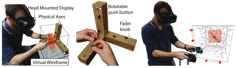
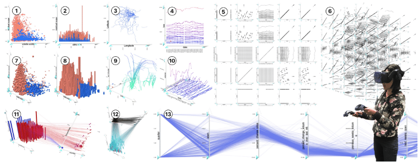
We have Tim Dwyer on the show to talk about Immersive Analytics, the use of virtual reality and other immersive technology to analyze and present data visually. Tim is a Professor of Data Visualisation and Immersive Analytics at Monash University in Melbourne and his research focuses on the human and technological aspect of immersive analytics. On the show we talk about what immersive analytics is, what are the major opportunities and challenges and how one gets started experimenting with it. Tim also talks about some of the specific projects he and his collaborators developed on his lab.
1024x302.png" alt="" class="wp-image-3769">
1024x345.jpg" alt="" class="wp-image-3770">
1024x286.png" alt="" class="wp-image-3773">
1024x286.png" alt="" class="wp-image-3774">
Links
- Book: Immersive Analytics
- HoloLens 2
- Magic Leap
- Milgram’s article on Augmented Reality
- Videos of Tim’s research work:
[Our podcast is fully listener-supported. That’s why you don’t have to listen to ads! Please consider becoming a supporter on Patreon or sending us a one-time donation through Paypal. And thank you!]
How do you represent data with sound instead of graphical properties? Is it even possible?
It turns out that it’s not only possible, but there is an entire field — called sonification — that is dedicated to representing data with sound.
In this episode we are joined by Hannah Davis, a data visualization and sonification expert, to talk about how sonification works and how she has gone about making her own amazing sonification projects, which create musical pieces based on data. Get your ears ready! This time you are not only going to listen to our voices but also to some really interesting sounds!
P.S. We’ve actually touched upon sonification once before in Data Stories. Check out our episode with Scott Hughes on the sonification of black holes.
- 1024x768.jpg">
1024x768.jpg" alt="" class="wp-image-3747">
- 662x1024.jpg">
662x1024.jpg" alt="" class="wp-image-3746">
- 1024x768.jpg">
1024x768.jpg" alt="" class="wp-image-3745">
- 04-08-at-21.54.05-1024x510.png">
04-08-at-21.54.05-1024x510.png" alt="" class="wp-image-3744">
LINKS
-
Moritz’s Course
- Beyond Heatmaps: Course on climate change visualization at the Digital Media program at HfK Bremen
- Listen: Apple Blossom is Shifting by Katja Striedelmeyer
- We talked about sonification once before!
-
Sonification examples
- olysymphony.html?">Fractions of a second
- Match 104 – James Murphy Remix | The US Open Sessions
-
Hannah
- Hannah’s web site: http://www.hannahishere.com
- Hannah’s talk at Eyeo 2018
- Article: Subjective Data
-
Hannah’s projects
- 134.mp4?dl=0">Sonified Data
- TransProse (Peter Pan, The Road, Clockwork Orange)
- Text to Music Generator
- At the Louvre: Human-Computer Symphony
- UFO Data (file 1, file 2)
- Percival with SynthBeats laptop orchestra
- Laughing room
- How folks can get started with sonification
 Beccario-cambecc-square-small-150x150.png" alt="">
[There are no ads on Data Stories because we’re listener-supported; please consider contributing to the show! Oh…and now Data Stories is on Instagram!]
Today we are joined by Cameron Beccario who created the immensely impressive Earth visualization — a beautiful, geeky, mesmerizing look at the small blue marble we call home. On the show Cameron tells us all about the story behind the project, its evolution, and its reception — plus, at the end, we have a bonus chat about the state of data visualization in Japan.
Enjoy the show!
Links
- http://earth.nullschool.net
- Data Visualization Society
- Cameron’s Github repository
- Fernanda Viegas’ & Martin Wattenberg’s Wind Map
- Data Viz Japan
- Tohoku earthquake visualization
-
03-04-at-16.36.58-1-1024x576.png" alt="">
-
-
-
-
-
-
-
[There are no ads on Data Stories because we’re listener-supported; please consider contributing to the show! Oh…and now Data Stories is on Instagram!]
e1551384988353-959x1024.jpg" alt="" class="wp-image-3666">
Wihbey-Final-1-1024x683.jpg" alt="" class="wp-image-3665">
 1024x1024.png" alt="" class="wp-image-3660">
- 01-419x1024.png">
01-419x1024.png" alt="" class="wp-image-3657">
- 03-1024x826.png">
- 02-1024x822.png">
- 1024x697.jpg">
1024x697.jpg" alt="" class="wp-image-3661">
- 1024x680.jpg">
1024x680.jpg" alt="" class="wp-image-3662">
We have Pedro Cruz and John Wihbey on the show to talk about their beautiful project, the Simulated Dendrochronology of U.S. Immigration. There are many ways that immigration can be represented visually, but Pedro and John came up with a very compelling one: they use the metaphor of tree rings to show how migration patterns of people to the United States have changed over time. The final piece is utterly beautiful and evocative: we are the product of many layers of immigration.
On the show we talk about how they came up with this idea, the implementation of the visualization, the attempts they tried before producing the final version, and the role of metaphors in visualization. Make sure you take a closer look at the visualization before listening!
And enjoy the show!
Links
- Project Page and Video
- Pedro Cruz
- John Wihbey
- George Lakoff and Mark Johnson, Metaphors We Live By
- Andrew Ortony, “Metaphor and Representation” in Metaphor and Thought
- Donna Cox “The Art and Science of Visualization: Metaphorical Maps and Cultural Models”
- John’s upcoming book: The Social Fact (MIT Press, April 2019)


[Our podcast is fully supported by our listeners. Please consider becoming a supporter on Patreon or sending us a one-time donation through Paypal. And thanks!]
Oh dashboards… dashboards… what are they? For some, they are just ugly examples of bad visualization design (speed dials anyone?). For others, they are a first citizen of the data visualization world that deserve to be learned, studied, and understood.
To dig into this debate, we have Lyn Bartram of Simon Fraser University and Alper Sarikaya of Microsoft Power BI on the show to talk about an exciting research project they developed. Their research seeks to build a better picture of what dashboard are and how they are used “in the wild.” The results are summarized in a paper they wrote with their colleagues from Tableau and Honeycomb.io: What Do We Talk About When We Talk About Dashboards?
On the show we talk about how the project got started, what they discovered by analyzing a large corpus of dashboards, and the many ramifications of their research.
Enjoy the show!
Links
- Project page
- Supplemental material with images of all the dashboards the team analyzed (suppl.zip">zip)
[Our podcast is fully supported by our listeners. Please consider becoming a supporter on Patreon or sending us a one-time donation through Paypal. Thanks!]
What is uncertainty? Why is it important to take it into account when designing data visualizations? And how do you actually do so? We explore these and other questions with Jessica Hullman of Northwestern University and Matthew Kay of the University of Michigan. Jessica and Matt have written many publications on the topic that help orient us to the intricate world of uncertainty, probabilities, and their relevance to data visualization.
We hope you enjoy the show!
Links
- National Institute for Standards (NIST): “Measurement Error”
-
Useful material to learn about uncertainty visualization:
- Leland Wilkinson’s The Grammar of Graphics (chapter on uncertainty)
- Howard Wainer’s Picturing the Uncertain World
- Richard McElreath’s Statistical Rethinking
- Claus Wilke’s uncertainty.html">uncertainty vis chapter
- Matt’s github of uncertainty examples
-
Hypothetical Outcome Plots
- Hypothetical Outcome Plots: Experiencing the Uncertain
- Paper: Hypothetical Outcome Plots Outperform Error Bars and Violin Plots for Inferences about Reliability of Variable Ordering
- Paper: fernandes.pdf">Hypothetical Outcome Plots Help Untrained Observers Judge Trends in Ambiguous Data
- Gregor Aisch on: “Why we used jittery gauges in our live election forecast”
- Ensembles – Visualizing storms
-
Visual variables used to show probability/confidence
- Related: Value suppressing color palettes
- Related: Sketchy rendering
-
Static depictions of outcomes (quantile dotplot)
- Paper: When (ish) is My Bus? User-centered Visualizations of Uncertainty in Everyday, Mobile Predictive Systems.
- Paper: Uncertainty Displays Using Quantile Dotplots or CDFs Improve Transit Decision-Making
- Paper: ImaginingReplications-InfoVis.pdf">Imagining Replications: Graphical Prediction & Discrete Visualizations Improve Recall & Estimation of Effect Uncertainty
-
Evaluation
- Paper: In Pursuit of Error: A Survey of Uncertainty Visualization Evaluation.
134-promo.mp4">http://datastori.es/wp-content/uploads/2019/01/DS-134-promo.mp4
- Paper: In Pursuit of Error: A Survey of Uncertainty Visualization Evaluation.
[Thinking of gift-giving this holiday season? Consider a gift to Data Stories! You can join our growing community of Patreons or make a one-time donation to us on Paypal.]
Here we go! Another year has passed and lots has happened in the data visualization world. This time we decided to scramble things up again with a new annual review format: five podcasters (including ourselves!) reflecting back on year 2018. We’re lucky to be joined by Jon Schwabish from PolicyViz, Alli Torban from DataViz Today, and Cole Nussbaumer Knaflic from Storytelling with Data.
This was a long chat! But we had a lot to cover: major trends, favorite projects, new tools, and standout people, companies, studios, conferences, books, and blogs. There is a lot to learn there. Don’t miss our long list of links below!
As always, thanks for following along with us this year. And special thanks go to our supporters and to Destry and Florian for their amazing work behind the scenes.
We wish you all Happy Holidays and a Happy New Year!


Links
Major Trends
Favorite Projects
- Flowing Data’s “Divorce and Occupation”
- not-mobs.html">The New York Times’s “Tracing a Meme From the Internet’s Fringe to a Republican Slogan”
- Simulated Dendrochronology of U.S. Immigration
- Geoff Boeing’s “Comparing US City Street Orientations”
- house-elections.html">New York Times’s “U.S. House Election Results 2018”
- Pudding’s “Women’s Pockets are Inferior”
- Augmented reality on The Weather Channel
- RJ Andrews’s “Picturing the Great Migration”
Noteworthy Tools
- Vizzlo, Venngage, Infogram
- illustrator.com/">Data Illustrator, Lincoln, Charticulator
- viz.github.io/">Altair
Standout People, Companies and Studios
- Topi Tjukanov
- Elijah Meeks’s “3rd Wave Data Visualization”
- Lisa Charlotte Rost
- Neil Richards
- Kat Greenbrook
- The Pudding
- Valentina d’Efilippo
Conferences
Books
- Andy Kriebel & Eva Murray, MakeoverMonday
- Mark Monmonier, How to Lie with Maps
- Sandra Rendgen, The Minard System: The Complete Statistical Graphics of Charles-Joseph Minard
- Catherine D’Ignazio & Lauren Klein, Data Feminism
- Scott Berinato, Good Charts Workbook: Tips, Tools, and Exercises for Making Better Data Visualizations
- Giorgia Lupi and Stefanie Posavec, Observe, Collect, Draw! A Visual Journal
Books Coming in 2019
- RJ Andrews, Info We Trust: How to Inspire the World with Data
- Kieran Healy, Data Visualization: A Practical Introduction
Blogs
- Multiple Views: Visualization Research Explained
- Maarten Lambrechts: Xenographics
- Pew Research, Data Labs
- Flourish tool blog
- PolicyViz
- Jonathan’s card game
[Thinking of gift-giving this holiday season? Consider a gift to Data Stories! You can join our growing community of Patreons or make a one-time donation to us on Paypal.]

On the show we start by talking about the precursors to this generation of tools, such as Lyra and Data Driven Guides. We then pivot to the latest developments including Charticulator, illustrator.com">Adobe’s Data Illustrator, and Lincoln.
What do these tools make possible that is still impossible or not so easy to do with the existing tools? What are their more exciting features? How do they differ in the way that they work? Why are we observing this trend now? And are they ultimately going to become real products? We ponder these and other questions on the show with Andy.
Enjoy listening!
Links
- Multiple Views: Visualization Research Explained
- Andy Kirk
- Visualisingdata’s list of data visualization tools
- Tableau
- Lyra
- Data Driven Guides
- Brett Victor’s Drawing Dynamic Visualizations
- Data Stories episode on Lyra
- Charticulator
- illustrator.com">Adobe’s Data Illustrator
- Lincoln
- Open Refine
- morph.graphics
Related episodes
[Thinking of gift-giving this holiday season? Consider a gift to Data Stories! You can join our growing community of Patreons or make a one-time donation to us on Paypal.]
“Would you define this as a dashboard?” The question provoked quite a reaction!
In this episode, we talk about and-beauty.net/projects/peakspotting">Peak Spotting, a new data visualization tool designed to help capacity managers at the German railway Deutsche Bahn handle passenger loads within the train system.
We recorded the episode live in Berlin, all together in the same room, with Moritz, the creative lead of the project, as well as the project’s other collaborators: project director Christian Au, technical lead Stephan Thiel, and designer Christian Laesser.
We talk about how the project started, the process the team followed to design the tool, how people at the German railway are using it, finding innovation within big companies, and the role of visualization in the movement towards automation.
Enjoy the show!
Links
-
- mainz.de/en/directory/person/christian-au/">Christian Au
-
- Moritz’s OpenVisConf keynote
-
- and-beauty.net/projects/peakspotting">Moritz’s writeup of the project
-
- Studio NAND’s writeup of the project
- spotting-train-data-visualization.html">Christian Laesser’s writeup of the project
[If you benefit from Data Stories, consider becoming a supporter on Patreon or making a one-time donation to us on Paypal. We fully depend on listener support to keep the show running!]
It was a great week in Berlin! Info+ and IEEE VIS took place at the same time and both Enrico and Moritz were there to document the conferences. We also organized a super fun Data Stories listeners meetup — more on that to come!
This week, our friends Jessica Hullman and Robert Kosara join Enrico to comment on their greatest highlights from IEEE VIS.
We discuss a handful of IEEE VIS events and then spotlight a few projects and papers that we especially liked. As usual, this is just a very thin slice of the conference offerings. There is much more to discover from the program!
Find links below to all the projects that we discuss on the show.
Enjoy!
Links:
- aachen.de/">Vis in Practice
- VisComm Workshop
- Formalizing Visualization Design Knowledge as Constraints: Actionable and Extensible Models in Draco
- Design Exposition with Literate Visualization
- vis.io/">Seq2Seq-Vis: A Visual Debugging Tool for Sequence to Sequence Models
- RuleMatrix: Visualizing and Understanding Classifiers with Rules
- Charticulator: Interactive Construction of Bespoke Chart Layouts
- preprint.pdf">What Do We Talk About When We Talk About Dashboards?
- Face to Face: Evaluating Visual Comparison
- FiberClay: Sculpting Three Dimensional Trajectories to Reveal Structural Insights
- olfac.pdf">Information Olfactation: Harnessing Scent to Convey Data
Related episodes

[Our podcast is fully listener-supported, which means that it’s actually your podcast! Please consider making a contribution on Patreon or sending us a one-time donation through Paypal. Help us to stay ad-free!]
This week we have Robert Simmon on the show to discuss satellite imagery. Robert is a data visualization engineer at Planet Labs, where he creates visualizations of the earth from satellite sensor data. Previously a Data Visualizer and Designer at NASA, Robert is also known as “Mr. Blue Marble” for the image of Earth he created, which Apple later adopted as their default image for the iPhone lock screen.
On the show we talk about satellite imagery and what it takes to transform satellite data into something that is enlightening and intelligible. We also talk about the multiple parallels between satellite images and data visualization, the key role that color plays in creating effective visualizations, and Robert’s amazing color guide “Subtleties of Color.”
Links
- Robert Simmon on Twitter
- Robert Simmon on Medium
- What’s False about True Color
- Making Sense of Satellite Data, An Open Source Workflow
- Subtleties of Color
- Gentle intro to GDAL
- 21st Century Landscapes

We have Steve Haroz on the show to talk about visual perception in visualization. Steve is a research scientist at Saclay, France near Paris (AVIZ) where he studies how “the brain perceives and understands visually displayed information like charts and graphs.”
Steve is also a very active figure on Twitter, where he is frequently asked to comment on visual perception problems in visualization.
On the show, we talk about what vision science is, practical examples of the use of vision science in data visualization, and how to use visual science to make predictive decisions about our data visualization designs.
Enjoy the show!
Links
- Steve Haroz
- Information Visualization: Perception for Design by Colin Ware
- Steve’s paper “Isotype Visualization: Working Memory, Performance, and Engagement”

[If you enjoy listening to our show, please consider supporting us on Patreon or sending us a one-time donation through Paypal. Data Stories runs thanks to your financial support!]
We have Cole Nussbaumer Knaflic on the show to talk about her work in visual storytelling. Cole is an educator, blogger, freelancer and author of Storytelling with Data, a successful data visualization book about effectively presenting data through visualization.
We talk about how Cole got her start in visualization through her former job at Google, how she created her business, the story behind her book, and many of her other activities (including her great podcast!).
The episode is full of useful tips, especially for those of you who are thinking of becoming a vis-oriented business-owner or freelancer.
Enjoy the show!
Links
- Enrico’s Free Information Visualization Specialization on Coursera
- Storytelling with Data
- Cole’s book, Storytelling With Data
- The Storytelling with Data Challenge
- Cole’s Storytelling with Data podcast
[If you enjoy listening to our show, please consider supporting us on Patreon or sending us a one-time donation through Paypal. Data Stories runs thanks to your financial support!]
We have Nathan Yau with us on the show to talk about his mythical FlowingData blog. Nathan was one of the first people to write a blog about data and visualization, and he is one of the very few who continues to blog virtually every day after more than ten years.
If you want to know what has happened lately in visualization, you can’t go wrong by visiting his site. It’s very comprehensive and never misses a beat.
On the show, we talk about how and why Nathan started FlowingData, the evolution of the blog and visualization over the years, his data visualization projects and membership program, and the secret “sauce” behind his persistence!
Enjoy the show!
[If you like what we do, please consider supporting us on Patreon or sending us a one-time donation through Paypal. Data Stories runs thanks to your financial support. Thx!]

Sheelagh Carpendale is Professor in the Department of Computer Science at the University of Calgary, where she leads the Innovations in Visualization (InnoVis) research group. Sheelagh is one of the most prominent figures in visualization research and, this week, she joins us to discuss the research taking place in her lab, as well as her innovative ideas about all sorts of information visualization. Sheelagh is renowned for taking a much more holistic view of visualization than usual; she emphasizes interaction, visualization beyond the confinements of desktop displays, and the use of design, qualitative research, and psychology. On the show we talk about the uses of sketching in data visualization, the concept of “active reading” of visualizations, and the standard data viz ideas that are holding us back.
Enjoy the show!
Links
- Sheelagh Carpendale
- Sheelagh’s research on Data Sketches
- Paper: An Exploratory Study of Data Sketching for Visual Representation
- Extended material on data sketching
- Project: Slicing the Aurora
[If you like what we do, please consider supporting us on Patreon or sending us a one-time donation through Paypal. Data Stories runs thanks to your financial support!]
Most often in data visualization we depend on traditional charts, but occasionally we stumble onto something new, maybe even something weird: something that is interesting and beautiful. How many charts of this type exist? And do they have anything in common?
In this episode we have Maarten Lambrechts on the show to talk about his Xenographics project: a growing collection of “unusual charts and maps.”
We talk with Maarten about examples of xenographics, the system Maarten developed to organize the collection, the role of innovation in visualization, and the future of these unusual designs.
We hope you enjoy the show!
Links
- Maarten Lambrechts
- Xenographics
- Rock and Poll
- Eurosearch Song Contest (2017, 2018)
- RAW visualization tool
- Mike Bostock
- Location + time: urban data visualization
- Steve Haroz’s collection of open access vis papers
Related episodes
[If you like what we do, please consider supporting us on Patreon or sending us a one-time donation through Paypal. Data Stories runs thanks to your financial support!]
As creators of data visualization, it is important for us to remember that many of our platforms are not accessible to people who are blind or visually impaired. What can we do to help non-sighted people access the wealth of information that we convey visually?
To discuss this topic we have on the show Steve Landau, the founder of Touch Graphics, a company that develops products that “rely on multi-sensory display techniques and audio-haptic interactivity.”
We talk with Steve about the history of the company, the process for creating tactile graphics, and his suggestions for making visualization more accessible.
Enjoy the show!
Links
Related episodes
1.jpg">
Data Stories runs thanks to the help of our listeners. Please consider supporting us on Patreon or sending us a one-time donation through Paypal. And thanks so much for your support!
This week, we have Prof. Boris Müller from potsdam.de/studieren/fachbereiche/design/">FH Potsdam on the show! Moritz and Boris discuss the potsdam.de/projects/senses/">SENSES research project, which visualizes climate change scenarios. They also talk generally about design and science collaboration.
In other news, if you work in science and would like to improve your data visualization skills, make sure to check out the Graphic Hunters summer school In Utrecht, Netherlands, where Moritz will be offering a training on August 21, 2018.
Enjoy the show!
Links:
- Moritz’s training on data visualization for scientists
- Boris Müller
- potsdam.de/projects/senses/">SENSES
- Bringing Design to Science
- Strategies for Design-Science Collaborations
- Article on intuition
Preview-Small.png">
Related episodes

[Data Stories runs thanks to the help of our listeners. Please consider supporting us on Patreon or sending us a one-time donation through Paypal. And thanks so much for your support!]
We have Dominik Moritz, Jacob Vanderplas, and Kanit “Ham” Wongsuphasawat on the show to talk about Vega-Lite and viz.github.io/">Altair. Dominik and Ham are PhD students at the Interactive Data Lab at the University of Washington with Jeff Heer, and Jacob is the director of Open Software at the University of Washington’s eScience Institute and the main person behind the development of Altair, the porting of Vega-Lite to Python.
Vega-Lite is a new declarative language for the development of interactive data visualizations based on a grammar of graphics (similar to R’s ggplot2). One of the most interesting innovations it provides is the development of a grammar that also includes interaction and linking between views. In addition, Altair brings Vega-Lite to the Python environment, making it available to innumerable data scientists who work in Python and the Jupyter Notebook.
On the show we talk about these two new environments, the grammar used by Vega-Lite, how to get started with it, and more.
Enjoy the show!
Links
- Jacob Vanderplas
- Kanit “Ham” Wongsuphasawat
- Dominik Moritz
- Vega-Lite
- viz.github.io/">Altair
- grammar.html">Grammar of Graphics
- Vega-Lite Demo: Exploring Data
- viz.github.io/case_studies/exploring-weather.html">Altair Demo: Exploring Seattle Weather
ani.gif" alt="" width="694" height="608">

[Data Stories runs thanks to the help of our listeners. Please consider supporting us on Patreon or sending us a one-time donation through Paypal. And thanks so much for your support!]
This week we have David Robinson on the show to talk about data science, in particular the role of data visualization in data science. David is Chief Scientist at Data Camp and author of multiple data science books and R packages. He also writes a great blog called “Variance Explained.”
On the show we talk about visualization as a data analysis tool, the problem of validation in exploratory data analysis, and David’s opinion on programming versus GUI interfaces. Also, don’t miss his great advice — and very generous offer! — on how to get started in data science!
Enjoy the show!
Links
- David Robinson
- David’s blog Variance Explained
- Data Camp
- Analyzing networks of characters in ‘Love Actually’
- bloggers.com/using-and-abusing-data-visualization-anscombes-quartet-and-cheating-bonferroni/">Using and Abusing Data Visualization: Anscombe’s Quartet and Cheating Bonferroni
- Advice to aspiring data scientists: start a blog
- David Robinson on Twitter
- Introduction to the Tidyverse course
Related episodes
[This podcast is fully supported by our listeners. If you enjoy listening to Data Stories, consider supporting us on Patreon. And now we also accept one-time donations through Paypal: just use this link. Thanks so much for your support!]
In this episode we have Karen Schloss on the show to talk about color. Yes, color! Karen is Assistant Professor at the University of Wisconsin Madison where she conducts research on the effective uses of color in visualization and everyday tasks.
Karen walks us through the intricacies of color: explaining how it works and why it is so hard to get right. We also discuss the infamous rainbow color map, the association between colors and meaning, the tools developed in her lab, and her fascinating research on coloring trash bins!
Enjoy the show…
Links
- News from Moritz: 123 data, a new data visualization exhibition in Paris
- Karen Schloss and her research on color
- Karen’s color tool Colorgorical
- Article: “When communicating with color, balance can be a path to accuracy”
- Enrico’s work with climate scientists


[This podcast is fully supported by our listeners. If you enjoy listening to Data Stories, consider supporting us on Patreon. And now we also accept one-time donations through Paypal: just use this link. Thanks so much for your support!]
This week we have Miriah Meyer (University of Utah) and Danyel Fisher (Microsoft Research) on the show to talk about their new book Making Data Visual, which covers areas that other visualization books typically do not address: namely, how to go from formulating questions to building visualizations that solve actual problems that people have.
On the show we talk about how the book came to be; some of the concepts introduced by Miriah and Danyel in the book, such as the use of proxy tasks for data; and how you could use it for your own projects.
Enjoy the show!
Links:


[This podcast is fully supported by our listeners. If you enjoy listening to Data Stories, consider supporting us on Patreon!]
We have Lisa C. Rost and by-data.net/">Gregor Aisch on the show to talk about the exciting work they are doing at Datawrapper. Lisa and Gregor have recently joined the company in Berlin, coming from various experiences in data journalism in the US.
Lisa is known for her long, thoughtful and beautiful blog posts and visualization guides. Gregor is a former graphics editor at the New York Times and has also developed many useful visualization libraries and tools.
On the show we talk about Lisa and Gregor’s transitions from the world of journalism to a software company, the market for data visualization products, and what we can expect from Datawrapper in the future.
Enjoy the show!
Links
Lisa Charlotte Rost: https://lisacharlotterost.de/
Gregor Aisch: by-data.net/">https://driven-by-data.net/
Datawrapper: http://datawrapper.de
River (DW’s place to exchange relevant data, charts and maps)
Related episodes

[This podcast is fully supported by our listeners. If you enjoy listening to Data Stories, consider supporting us on Patreon!]
We have Evanthia Dimara on the show to talk about cognitive bias and the role it plays in visualization. Evanthia has a PhD from INRIA and is now a postdoctoral researcher at the Institute for Intelligent Systems and Robotics (ISIR) in Paris. Her work focuses on data visualization and decision-making, and she specializes in understanding how bias affects our decisions when they are supported by visual representations.
On the show we talk about cognitive biases in general, introducing some of the most popular and funny examples. We then switch gears and Evanthia describes how the effects of specific biases translate to the world of data visualization and whether visualization can play a role in reducing bias.
Enjoy the show!
Links
- Evanthia Dimara
- Daniel Kahneman’s book: “Thinking Fast and Slow“
- Epic list of cognitive biases
- Evanthia’s paper on: “The Attraction Effect in Information Visualization”.
- The cognitive bias song!
Related episodes

[This podcast is fully supported by our listeners. If you enjoy listening to Data Stories, consider supporting us on Patreon!]
How should we interact with machine learning? Is there a way to better understand what machine learning systems do and how? What role can visualization play in machine learning? These are some of the questions we discuss with Saleema Amershi on the podcast this week.
Saleema is a Researcher at Microsoft Research AI (MSR AI) where she works on technologies for helping people build and use machine learning systems.
On the show we explore the need for interaction in machine learning and discuss some of the fascinating work Saleema has done in this space, as well as what visualization can do to make machine learning more transparent for its users.
Enjoy the show!
Links
- Saleema Amershi’s home page
- Saleema’s paper ‘changA.pdf">Revolt: Collaborative Crowdsourcing for Labeling Machine Learning Datasets’
- Saleema’s paper on ModelTracker ‘ModelTracker: Redesigning Performance Analysis Tools for Machine Learning’

[This podcast is fully supported by our listeners. If you enjoy listening to Data Stories, consider supporting us on Patreon!]
If you haven’t heard talk about machine learning (ML) lately, you must be living under a rock! For our part, we have finally managed to record a whole episode on the use of ML for art and visualization. Artist and programmer Gene Kogan joins us on the show to talk about new developments in this space, as well as new challenges and opportunities. Gene has developed numerous art and design pieces using ML technologies, which we also discuss on the show. (You should definitely check out his home page: http://genekogan.com/). Last, we talk about the role of ML in visualization and how you can integrate ML in your own projects.
Enjoy!
Links
- Gene Kogan
- Mario Klingemann
- Wikipedia page on ‘Adversarial Machine Learning’
- David Ha’s sketch-rnn
- Teachable Machine from Google Creative Lab
- Machine Learning for Artists (ml4a) GitHub page
- Deep Dream Generator
- Forma Fluens
- Justin Timberlake’s ‘Filthy’ video
- Book: Nick Bostrom’s “Superintelligence”
- Gene Kogan’s schedule
- Gene Kogan on Twitter

Michelle Borkin is Assistant Professor at Northeastern University where she studies the use of visualization in science research, in particular how it impacts human perception and cognition. On the show we talk about how the data viz community can better support the work of scientists, her popular research on data visualization memorability and, of course, the infamous data viz dinosaur.
LINKS
- Michelle Borkin
- Michelle’s paper: “infoviz.pdf">Evaluation of artery visualizations for heart disease diagnosis”
- Michelle’s research on camera.pdf">data visualization memorability
- Michelle’s TED Talk
- NUVis Consortium
- MassVis Data Set of Charts

There are infinite ways to represent data. Here’s one of the more creative ones: Alice Thudt makes pottery — such as cups, plates, or teapots — that show data! Her project in-clay.alicethudt.de">Life in Clay started off as a twist on a hobby, and has since become part of her PhD research on personal data visualization. In our conversation with Alice, we learn all about what it takes to put data on the table.
PS: At the end, you’ll also hear a quick update on the Information is Beautiful awards, where Alice scored an honorable mention! Congratulations!
If you enjoy Data Stories, consider supporting us on Patreon. Every contribution helps!
If you enjoy listening to Data Stories, consider becoming a supporter on Patreon. Thanks!
We are at the end of yet another full year, folks! And once again we have decided to go around the world to see what has happened in vis in a whole range of countries.
It’s been a long journey. This year we have, Spe Chen from Beijing, China; Pia Faustino from Manila, Philippines; Pinar Dag in Istanbul, Turkey; Justin Yarga from Ouagadougou, Burkina Faso; Harry Stevens in New Delhi, India; and Qristina Parjiani from Tbilisi, Georgia.
Let us know how your year was and what you expect from 2018!
Happy Holidays everyone and thanks for listening!
Links
Spe
- Data Works
- G2 data viz library
- The Hu Line, Chinese newspaper
- Dataworks’ Pay to Learn: A graphical analysis of the link between housing and quality education in Beijing
Pia
Pinar
- Pinar Dag on Medium
- Pınar Dağ’s academia.edu page
- Open Database of Deceased Workers in Turkey (Update all the time)
- Analysing Turkish Imam Hatip High Schools Over the Past Decade
- The first massive open online course in Turkey about Data Literacy and Open Data training ( Also data visualization training module)
- Data Journalism Platform -Turkey
- Turkish Data Journalism News Site
- Open Data and Data Journalism Association -Turkey
- The Data Visualisation Catalogue translated into Turkish
- Open Data Day 2017 -Turkey
Justin
Harry
- Harry Stevens on Hindustan Times
- Hindustan TImes’ “Find out the GST rate for over 1,800 goods and services”
- Hindustan TImes’ “What’s it like to get trolled all day long?”
- schools-12000-teacher-vacancies.html">Hindustan Times’ “Delhi needs to hire more than 12,000 teachers, but that would be illegal”
- ProPublica’s “Dollars for Docs”
- ProPublica’s “Surgeon Scorecard”
- “The Death of Interactive Infographics?”
- “In Defense of Interactive Graphics”
Qristina
Related episodes


On the show this week we have Michael Gonchar of the New York Times Learning Network and Sharon Hessney of the American Statistical Association to talk about the New York Times’s project, “What’s Going On In This Graph?”
The project aims to improve students’ visual literacy by analyzing a specific chart and participating in online discussions. Each month the New York Times publishes a new chart and ask students to discuss it by answering a series of questions: What do you notice? What do you wonder? Are there items you notice that answer what you wonder? Where could you find the answers to what you wonder?
On the show we talk about how the project was born, how students participate in the process, what they learn, and our guests’ plans for the future of the series.
We strongly encourage you to participate! It’s fun and useful!
Enjoy the show!
[If you enjoy Data Stories, consider supporting us on Patreon. The show is now fully funded by our listeners!]
Links
- New York Times Learning Network
- New York Times’s What’s Going On In This Graph?
- New York Times’s What’s Going On In This Picture?
-
The 3 graphs published so far:
- going-on-in-this-graph-sept-19-2017.html">“Houston May Get 50 Inches of Rain. How Long Does It Take Your City to Get that Much?”
- going-on-in-this-graph-oct-10-2017.html">“Is Sushi Healthy? What About Granola Where Americans and Nutritionists Disagree”
- going-on-in-this-graph-nov-14-2017.html?emc=eta1&_r=0">“Labor Shortage Gives Wonders an Edge”
[If you enjoy Data Stories, consider supporting us on Patreon. The show is now fully funded by our listeners!]
We have Catherine D’Ignazio on the show this week to talk about feminist data visualization. Catherine is Assistant Professor of Data Visualization and Civic Media at Emerson College, where she works across art, design, science and research.
On the show Catherine explains how feminist theory can be used as a lens to look at some interesting problems in visualization and data analysis in general. We also talk about the struggle between objectivity and relativism, methods to apply the guidelines proposed by Catherine to data visualization work, and some super interesting projects she has developed over the years.
Enjoy the show!

Links
- Catherine’s project Boston Coastline: Future Past
- Catherine’s project The Babbling Brook
- Catherine’s “What Would Feminist Data Visualization Look Like?”
- Donna Haraway’s “Situated Knowledges: The Science Question in Feminism and the Privilege of Partial Perspective”
- Giorgia Lupi’s “Manifesto for Data Humanism“
- Michelle Borkin’s What Makes Data Visualization Memorable
- Sandra Harding’s “standpoint-strong-objectivity.pdf">Rethinking Standpoint Epistemology: What is ‘Strong Objectivity’?”
- Catherine d’Ignazio and Lauren F. Klein’s “Feminist Data Visualization”
- More on Catherine’s “Data Biographies” teaching exercise
- Lauren F. Klein’s “Feminist Data Visualization; Or, the Shape of History”
[Like Data Stories? Consider supporting us on Patreon!]


We have Jessica Hullman from the University of Washington and Robert Kosara from Tableau Software on the show this week to share highlights from the IEEE VIS 2017 conference, which took place in Phoenix, Arizona in early October.
On the show, we discuss a number of interesting papers, panels and talks that were given at the conference. Of course, this is just a tiny portion of what took place in Phoenix! If you want to know more, take a look at the conference website.
Data Stories is brought to you by Qlik. Are you missing out on meaningful relationships hidden in your data? Unlock the whole story with Qlik Sense through personalized visualizations and dynamic dashboards which you can download for free at qlik.de/datastories.
Links
- Jessica Hullman
- Robert Kosara
- Paper: “Blinded with Science or Informed by Charts?”
- Paper: “Keeping Multiple Views Consistent”
- Paper: “Uncertainty Visualization by Representative Sampling from Prediction Ensembles”
- not-to-be-misled-by-the-jobs-report.html?_r=0">The New York Times on understanding and visualizing uncertainty
- The New York Times: draw-it-how-family-income-affects-childrens-college-chances.html">“You draw it”
- Paper: “Modeling Color Difference for Visualization Design”
- Paper: “Data Through Others’ Eyes”
- Paper: “Visualizing Dataflow Graphs of Deep Learning Models in TensorFlow”
- Panel: “Diversity in Visualization” (YouTube video)
- The Grace Hopper Celebration for women in technology
- Art Program and Giorgia Lupi’s capstone
- Giorgia Lupi’s capstone video
- Panel: InfoVis x Vision Science
- Robert’s six-part coverage of the conference
- Steve Haroz’s writeup of the conference
Related episodes
[Help us run the show by supporting us on Patreon!]
This episode we have Dan McGinn from Imperial College in London on the show to talk about visualizing Bitcoin data. Dan and his colleagues have developed real-time visualizations of transactions in the “blockchain,” the public ledger used by Bitcoin to create and document transactions.
The visualizations are displayed in their Data Observatory, a beautiful, high-resolution, 64-screen distributed rendering of a cluster with a canvas of 132M pixels.
On the show we discuss Bitcoin and how it works, the visualizations Dan and his colleagues have developed, and what can be done next to visualize cryptocurrencies.
Enjoy the show!
Data Stories is brought to you by Qlik. Are you missing out on meaningful relationships hidden in your data? Unlock the whole story with Qlik Sense through personalized visualizations and dynamic dashboards which you can download for free at qlik.de/datastories.
Links
- Dan McGinn
- YouTube video showing the visualizations in action
- Paper: Visualizing Dynamic Bitcoin Transaction Patterns
- Financial Times: Inside Europe’s biggest data visualisation laboratory
Related episodes

Adrien is based in Oakland, California. Her work has been exhibited internationally in galleries and museums around the world.
On the show, we talk about some her great artwork, including Tidal Datum, which depicts tidal charts from the National Oceanic and Atmospheric Administration (NOAA), and Grewingk Glacier, an ice sculpture depicting “the shape of the terminus of Grewingk Glacier as it has receded over 150 years time.”
We also talk about the process Adrien follows for her sculpture production, her thinking about work in physical versus digital materials, the boundaries between art and science, and how listeners might experiment with their own data sculptures!
Enjoy the show!
A minor correction to the show: It takes 29 days for the moon to go around the Earth, not the Sun.
Data Stories is brought to you by Qlik. Are you missing out on meaningful relationships hidden in your data? Unlock the whole story with Qlik Sense through personalized visualizations and dynamic dashboards which you can download for free at qlik.de/datastories.
Links
- Adrien Segal
- Adrien’s project Tidal Datum
- Adrien’s project Grewingk Glacier
- NOAA tidal data
- baths.htm">The Sutro Baths
- Rhino for 3D modeling
- Artist Marc Quinn’s Self series
- The DIKW pyramid: data, information, knowledge and wisdom
- 123d-catch.en.softonic.com/">Autodesk 123D Catch
- Smell researcher Sissel Tolaas
Related episodes

[Help us run the show by supporting us on Patreon!]
This week we have Krist Wongsuphasawat on Data Stories to talk about visualization projects at Twitter. Krist has a Ph.D. in Computer Science from the University of Maryland, where he worked with Ben Shneiderman. Most recently, he has been a Data Visualization Scientist at Twitter since 2012.
On the show, Krist describes the kinds of projects that the visualization team at Twitter develops. He also walks us through a few of the most popular of these projects, including their famous visualization of Game of Thrones.
Also, don’t miss Krist’s masterpiece post “How I carefully crafted a truly terrible data visualization”
Enjoy the show!
Data Stories is brought to you by Qlik. Are you missing out on meaningful relationships hidden in your data? Unlock the whole story with Qlik Sense through personalized visualizations and dynamic dashboards which you can download for free at qlik.de/datastories.
Links
- Wahl 2Q17
- Enrico’s website
- Krist’s website
- The Twitter interactive page
- “How every #GameOfThrones episode has been discussed on Twitter”
- Twitter platform for developers
- Labella.js
- Twitter D3Kit
- Krist’s post: “How I carefully crafted a truly terrible data visualization”
Related Episodes
- Data Stories 11: emoto with Stephan Thiel from Studio NAND
- Data Stories 54: Designing Exploratory Data Visualization Tools with Miriah Meyer
- Data Stories 62: Text Visualization: Past, Present and Future with Chris Collins
- Data Stories 95: Challenges of Being a Vis Professional in Industry with Elijah Meeks


In our latest episode, we talk about “C’est La Vis,” a research project developed to teach visualization at the elementary school level. We have two of the project researchers on the show, Basak Alper from NASA JPL and Nathalie Riche from Microsoft Research, to tell us all about it.
On the show we talk about the inception of the project, the findings they discovered by both talking to teachers and analyzing visualization materials used in schools, and the “C’est la Vis” prototype they have developed as a way to teach visualization to kids.
Enjoy the show!
Data Stories is brought to you by Qlik. Are you missing out on meaningful relationships hidden in your data? Unlock the whole story with Qlik Sense through personalized visualizations and dynamic dashboards which you can download for free at qlik.de/datastories.
Links
- Basak Alper
- Nathalie Riche
- “C’est la Vis” project page
- Project page on GitHub
- Research paper: Alper, B., Henry Riche, N., Chevalier, F., Boy, J., and Sezgin, M. Visualization Literacy at Elementary School. In Proceedings of CHI 2017.
Related episodes

This week we have Nicky Case on the show to talk about “explorable explanations,” interactive simulations that help people understand complex ideas.
Nicky has developed a whole set of projects over the years, including the popular “Parable Of The Polygons,” which describes how small biases can lead to segregation, and “To Build A Better Ballot,” which demonstrates the impact of various types of voting ballots.
On the show we talk about both of these projects in detail, the definition of explorable explanations, how simulation and interaction might play a role in visualization, and the future of this kind of project.
Enjoy the show!
Data Stories is brought to you by Qlik. Are you missing out on meaningful relationships hidden in your data? Unlock the whole story with Qlik Sense through personalized visualizations and dynamic dashboards which you can download for free at qlik.de/datastories.
Links
- Nicky’s Patreon page
- Project: Parable Of The Polygons
- Project: To Build A Better Ballot
- Nicky’s guide to explorable explanations
- Loopy (a tool to create explorables)
- Collection of explorable explanations
- Github Pages (to create web pages with iframes)
- Moral Machine (explorable on the “trolley problem”)
- Syrian Journey: Choose your own escape route (explorable on Syrian refugees)

In this episode we have famous cartoonist and comics theorist Scott McCloud. Scott wrote the popular books Understanding Comics (1993), Reinventing Comics (2000), and Making Comics (2006), which explain the theory and practice behind making comics and telling stories visually.
Scott has gained a big following among data visualization designers over the years. By following the strategies he describes in his books, one can develop rich narratives that are useful in data visualization as well as comics.
On the show we talk about his books, the power of frames, Scott’s definition of story, virtual reality, and what people in vis can learn from comic artists.
Enjoy the show!
Data Stories is brought to you by Qlik. Are you missing out on meaningful relationships hidden in your data? Unlock the whole story with Qlik Sense through personalized visualizations and dynamic dashboards which you can download for free at qlik.de/datastories.
Links
- Scott McCloud
- Scott’s TED Talk
- Scott’s wikipedia page
- Scott’s comic on Google Chrome
- Book: Understanding Comics: The Invisible Art
- Tilt Brush (integrating virtual reality)


[If you enjoy the show, consider supporting us on Patreon! You pay a small fee for each episode we publish.]
In this episode, we have Michael Correll and Jeff Heer from the University of Washington to talk about a novel visualization technique they developed called “Surprise Maps”: a new kind of map which visualizes what is most surprising in a dataset.
Using their own words: “The idea behind Surprise Maps is that when we look at data, we often have various models of expectation: things we expect to see, or not see, in our data. If we have these models, we can also measure deviation or difference from these models. This deviation is the unexpected, the data that surprise us.”
On the show we talk about how they came up with the idea for Surprise Maps, how they work, and potential applications and extensions for the technique.
Enjoy the show!


Data Stories is brought to you by Qlik. Are you missing out on meaningful relationships hidden in your data? Unlock the whole story with Qlik Sense through personalized visualizations and dynamic dashboards which you can download for free at qlik.de/datastories.
Links
- Medium post on Surprise Maps
- InfoVis 2016 Paper on Surprise Maps (SurpriseMaps-InfoVis.pdf">PDF)
- Github Repository:
- https://github.com/uwdata/bayesian-surprise
- Formal Bayesian Theory of Surprise: http://ilab.usc.edu/surprise/
- Example of application of Surprise Maps at CensusMapper

This is a good opportunity to thank all of you for listening to us and for supporting us with your comments, ideas and suggestions. It is also a good opportunity to thank all of our guests for making this show possible and donating their time to us.
In this episode we review some of the most successful episodes, talk about the major categories of episodes, and recollect some funny moments from recording the show. We also have a surprise segment where we reveal the “behind the scenes” of Data Stories.
For this special occasion we also prepared a first version of the Data Stories Dataset, a dataset with information extracted from Data Stories that you can use to create interesting visualizations. Let us know if you make something out of it!
Finally, don’t forget our crowdfunding initiative! You can support us on Patreon by pledging a fee for every episode we publish. We’re counting on you to switch to this crowdfunding model next month.
All the best!
Related episodes

It’s great to see such a big company hire a high caliber data viz professional like Kim and create a position with this name. Things seems to be moving in the right direction for viz after all!
Curious about what this news might mean for the industry, we invited Kim and her new boss Steph — Head of Content, Culture, and AI Design at Capital One — to learn about their plans.
This episode is a nice counterpoint to the episode we recently recorded with Elijah Meeks, which centered on the issues that data visualization professionals are facing in the industry.
Now, with Kim and Steph we talk about the decision to create this position, the value Capital One sees in visualization, and how they plan to scale visualization to a company of 40,000 employees.
Enjoy the show!
We’re collecting listener questions, ideas, and suggestions about Data Stories for our upcoming 100th episode. Leave us a message at +1-413-650-2713 and we may just feature your voice in the podcast!
Data Stories is brought to you by Qlik. Are you missing out on meaningful relationships hidden in your data? Unlock the whole story with Qlik Sense through personalized visualizations and dynamic dashboards which you can download for free at qlik.de/datastories.
Links
- Kim Rees: https://www.linkedin.com/in/kimrees/
- Steph Hay: http://www.stephaniehay.com/
- “New directions for Kim“
- “A Grand New Adventure”
- “Launching Data Visualization at Capital One”
[Help us fund Data Stories by donating on Patreon! We’re counting on you to switch to a crowdfunding model. Please visit our Patreon page for more details!]
Related episodes

Nadieh and Shirley recently paired up to create Data Sketches, a twelve-month collaboration. Each month they choose a topic and develop a visualization on their theme.
One nice aspect of the project is that they keep track of their entire development process, including the steps they followed to prepare the data, sketch the ideas, and create the final visualizations.
On the show we talk about the organization of the projects, some favorite visualizations from the year, the partnership between the collaborators, and how they balance Data Sketches with their freelancing work.
We’re collecting listener questions, ideas, and suggestions about Data Stories for our upcoming 100th episode. Leave us a message at +1-413-650-2713 and we may just feature your voice in the podcast!
Data Stories is brought to you by Qlik. Are you missing out on meaningful relationships hidden in your data? Unlock the whole story with Qlik Sense through personalized visualizations and dynamic dashboards which you can download for free at qlik.de/datastories.
Help us fund Data Stories by donating on Patreon! We’re counting on you to switch to a crowdfunding model. Please visit our Patreon page for more details!
Related episodes

Of course there are plenty of bullshit examples in data analysis and visualization. Carl and Jevin discuss many of them in their course.
On the show we talk about how they developed the course, what bullshit actually is and what distinguishes it from other types of misinformation, how to recognize examples of bullshit, and how to ‘call bullshit’ in an ethical way.
Enjoy this “bullshitty” episode!
Data Stories is brought to you by Qlik. Are you missing out on meaningful relationships hidden in your data? Unlock the whole story with Qlik Sense through personalized visualizations and dynamic dashboards which you can download for free at qlik.de/datastories.
Links
- Course home page: http://callingbullshit.org
- Video series of the course
- Carl Bergstrom
- Jevin West
- Feynman on “not fooling yourself“
- Harry Frankfurt’s bullshit.pdf">definition of bullshit
- Two case studies of bullshit: Caffeine Free and Foodstamp Fraud
- berlin.de/lehre/pmo/eng/Sagan-Baloney.pdf">The Fine Art of Baloney Detection
- How to Spot Fake News
- law.html">Brandolini’s Bullshit Asymmetry Principle
Help us fund Data Stories by donating on Patreon! We’re counting on you to switch to a crowdfunding model. Please visit our Patreon page for more details!
Related episodes

We have Jarke Van Wijk on the show this week. Jarke is a professor of visualization in the Department of Mathematics and Computer Science at Eindhoven University of Technology and an important historical figure (shall we say legend?) in visualization research.
Many amazing innovative techniques have been developed in his lab, including the widely adopted squarified treemaps (treemaps optimized to use rectangles as close as possible to squares) and hierarchical edge bundling (a technique to bundle the links of a graph together).
In this episode we hear the stories behind many of the innovations developed by Jarke and his group. Jarke also speaks to us about how to make cool stuff; the relationship between design, engineering and research; and artistry in visualization.
Enjoy the show!
Data Stories is brought to you by Qlik. Are you missing out on meaningful relationships hidden in your data? Unlock the whole story with Qlik Sense through personalized visualizations and dynamic dashboards which you can download for free at qlik.de/datastories.
Links
- Jarke Van Wijk Website
- Eagereyes guest post: Jarke ‘Jack’ Van Wijk’s List of Influences
- Paper: “The Value of Visualization” (2005)
- Jarke’s VIS 2013 Capstone (video)
- Martin Wattenberg’s Map of the Market
- Treevis.net: rostock.de/~hs162/treeposter/poster.html">A Visual Biography of Tree Visualization
- Unfolding the Earth: Myriahedral Projections
- YouTube video of Unfolding the Earth: Myriahedral Projections
[Help us fund Data Stories by donating on Patreon! We’re counting on you to switch to a crowdfunding model. Please visit our Patreon page for more details!]

Elijah sparked a recent debate with the following Twitter message: “Most people in #Datavisualization end up transitioning into data sci/eng or UI because there’s something wrong with the state of dataviz.” His tweet struck an interesting chord, so we thought we would bring him on the show to hear more.
In the episode, we talk about what is going on in the data visualization field and whether there really is a problem for data visualization professionals in the industry. We also talk about the great survey Elijah run on the state of the vis industry, which attracted around 1000 responses (!).
Enjoy the show!
Data Stories is brought to you by the upcoming 2017 Eyeo Festival. Eyeo brings together people drawn to the intersection of data, art, storytelling and creative technology. Tickets are on sale now, and almost gone. Get yours at eyeofestival.com. Converge to inspire.

Links
- Elijah’s original tweet
- Elijah’s follow-up article “If Data Visualization is So Hot, Why Are People Leaving?”
- Collection of responses: “Visualizing, The Field: Finding Our Way”
- Moritz’s response: “There be dragons: dataviz in the industry”
- Irene Ros’ Response: “In Defense of Simplicity, A Data Visualization Journey”
- 2017 Data Visualization Survey Results
[Help us fund Data Stories by donating on Patreon! We’re counting on you to switch to a crowdfunding model. Please visit our Patreon page for more details!]
Related episodes

In this episode, we have Alberto Cairo from the University of Miami on the show to talk about his newly announced lecture series on “Trumpery” and uncertainty.
Visualization and statistics promise to help people think and behave more rationally, but as we all know there is much more to fulfilling this promise than just showing “the right” graph.
With Alberto we touch upon many topics including partisanship and rhetoric, visualizing uncertainty and risk, and cognitive biases.
There is of course always much more to say on these topics, but this is a good start!
Enjoy the show.
Data Stories is brought to you by Qlik. Are you missing out on meaningful relationships hidden in your data? Unlock the whole story with Qlik Sense through personalized visualizations and dynamic dashboards which you can download for free at qlik.de/datastories.
Links
- *** Donate to our crowd-funding initiative on Patreon! https://www.patreon.com/datastories ***
- cuisine.net/workshops/kosovo/">Data Cuisine Kosovo
- Eyeo Festival
- Digital Humanities & Data Journalism Symposium
- The term “webster.com/dictionary/trumpery">Trumpery”
- Frankfurt’s bullshit.pdf">On Bullshit
- Course: Calling Bullshit in the Age of Big Data
- Jessica Hullman
- Paper: Hypothetical Outcome Plots Outperform Error Bars and Violin Plots for Inferences about Reliability of Variable Ordering
- Book: Naked Statistics
- Book: Geoff Cumming’s Understanding The New Statistics: Effect Sizes, Confidence Intervals, and Meta-Analysis (Multivariate Applications Series)
- Book: Steven Sloman and Philip Fernbach’s The Knowledge Illusion: Why We Never Think Alone


We have designer Valentina D’Efilippo and researcher Miriam Quick on the show to talk about their recent project OddityViz, a series of data visualizations of “Space Oddity,” the famous David Bowie song.
Valentina and Miriam deconstructed “Space Oddity” into multiple data sets to capture different aspects of the song: its narrative, rhythm, melody, and lyrics. Then they used each element to create a a unique data visualization piece.
They printed the visualizations as a series of posters and laser-carved acrylic black discs. Beautiful!
On the show we talk about their background, the process they followed to develop the project, and the events happening around it.
Enjoy the show!
Data Stories is brought to you by Qlik. Are you missing out on meaningful relationships hidden in your data? Unlock the whole story with Qlik Sense through personalized visualizations and dynamic dashboards which you can download for free at qlik.de/datastories.
Links
- Project’s website: https://www.oddityviz.com
- Twitter and instagram: @oddityviz
- David Bowie’s Space Oddity: https://www.youtube.com/watch?v=iYYRH4apXDo
- Shop: narrative-oddityviz-space-oddity.html">Art prints
- Valentina’s The Infographic History of the World
- Wieden+Kennedy: http://www.wk.com/
- OddityViz data set
- Melodyne sonic visualization tool: http://www.celemony.com/en/melodyne/what-is-melodyne
- Visualized Milan: http://visualized.com/milan/
- Miriam: http://miriamquick.com
- Valentina: http://www.valentinadefilippo.co.uk
Help Data Stories get crowdfunded! You can find the details at our Patreon page: https://www.patreon.com/datastories.

As you may have heard, Hans Rosling passed away on February 7, 2017. We are deeply saddened by this loss and, in remembering Rosling, we thought a tribute to him was due. The impact Rosling had on visualization and statistical communication is huge; he has left a very big legacy.
In this special episode, we asked five renowned visualization experts to tell us how Rosling’s work influenced them and how he impacted their own work. Here we hear from Kim Rees (Periscopic), Andy Kirk (Visualising Data), Robert Kosara (Eagereyes and Tableau), Kennedy Elliott (National Geographic), and Alberto Cairo (University of Miami).
Thanks so much Hans Rosling for your inspiration and legacy!
—
Some other tributes …
- Hans Rosling: An Appreciation – Robert Kosara, eagereyes.com
- Seeing human lives in spreadsheets: The work of Hans Rosling (1948–2017) – Max Roser
- Thank you, Hans Rosling – Francis Gagnon, chezvoila.com
- Thank you Hans Rosling – Andy Kirk, visualisingdata.com
Help Data Stories get crowdfunded! You can find the details at our Patreon page: https://www.patreon.com/datastories.
[Help us become a crowdfunded podcast! Go to our Patreon homepage to become a Data Stories patron. Pledging starts at $3 per episode. And thanks!]
In this episode we have on a nice trio of Italian visualizers — Michele Mauri (Density Design), Giorgio Uboldi (Calibro), and Giorgio Caviglia (Trifacta) — to talk about RAW, the data visualization tool they built to help people visualize data interactively.
michele.jpg">

Caviglia.jpg">
RAW is a very nice web-based and open-source data visualization tool that permits users to easily create charts without coding and to export them as vector graphics for further editing in external tools.
On the show we talk about why the team decided to develop RAW, how they got started, how they evolved RAW over time, the lessons they’ve learned, and their future plans.
Enjoy the show!
Data Stories is brought to you by Qlik. Are you missing out on meaningful relationships hidden in your data? Unlock the whole story with Qlik Sense through personalized visualizations and dynamic dashboards which you can download for free at qlik.de/datastories.
Links
- RAW: http://rawgraphs.io/
- Michele Mauri: http://www.densitydesign.org/person/michele-mauri/
- Giorgio Uboldi: http://calib.ro/
- Giorgio Caviglia: http://giorgiocaviglia.com/
- Pure JS: http://purejs.org/
- Angular JS: https://angularjs.org/
- D3 JS: https://d3js.org/
- Contactlab: http://contactlab.com/en/
Related episodes
Hey folks, we are back!
Before delving into this episode’s content, we have a special announcement: we started a crowdfunding campaign to turn Data Stories into a show that is fully-funded by our listeners! You can support us by visiting our Patreon page, and all the details of the initiative can be found here.

For our first episode of 2017 we had a very delightful chat with Brendan Dawes. Brendan is an artist and designer who works with interactive installations, data visualizations, and all things across the digital and physical sphere. He has a lot of super fascinating projects, including the famous Cinema Redux, an art piece that visualizes entire movies as a collection of snapshots.
On the show we talk about his projects, his design process and philosophy, his relationship with the data visualization world, how he generates ideas, and his upcoming projects.
We hope you enjoy this great conversation at the intersection of data, art, design, interaction and visualization!
Data Stories is brought to you by Qlik. Are you missing out on meaningful relationships hidden in your data? Unlock the whole story with Qlik Sense through personalized visualizations and dynamic dashboards which you can download for free at qlik.de/datastories.
Links
- Our Patreon crowdfunding campaign: https://www.patreon.com/datastories
- Brendan Dawes: http://www.brendandawes.com/
- Brendan’s Cinema Redux project: http://www.brendandawes.com/projects/cinemaredux
- Our episode on Indexical Visualization: http://datastori.es/80-indexical-visualization-with-dietmar-offenhuber/
- Brendan’s Doris Le Bot project: http://www.brendandawes.com/projects/dorislebot
- Brendan’s James Bond Kills project: http://www.brendandawes.com/projects/jamesbondkills
- Brendan’s Plastic Player project: http://www.brendandawes.com/projects/plasticplayer
- Brendan’s Six Monkeys project for email interaction: http://www.brendandawes.com/projects/sixmonkeys
- Processing software: https://processing.org/
- openFrameworks: http://openframeworks.cc/
Help Data Stories get crowdfunded! You can find the details at our Patreon page: https://www.patreon.com/datastories.
Hey everyone!
For the end of the year we decided to experiment with a new, very special kind of episode. We asked 6 different visualization experts from 6 different countries (and 5 different continents!) to tell us what happened this year in the data visualization space on their side of the world.
Shot-2016-12-21-at-10.58.39-PM.png">
We virtually traveled very far! On the podcast, we have Krisztina Szűcs from Hungary, Blaise Aboh from Nigeria, Simon Ducroquet from Brazil, Nikita Rokotyan from Western Siberia, Simon Elvery from Australia, and Jane Pong from Hong Kong.
To each, we asked four simple questions:
- Who are you and where are you located?
- How is the data visualization scene where you are?
- What were the major developments or projects this year?
- What do you hope for next year?
As you will discover by listening to this episode, a lot is going on in these countries. It’s fascinating to learn about it, and we really hope you’ll enjoy our new experiment. Let us know what you think!
…And with this, we wish you Happy Holidays and a Happy New Year! It’s been great serving all of you through our show, including a total of 24 episodes this year!
Take care.
This episode of Data Stories is sponsored by Qlik, which allows you to explore the hidden relationships within your data that lead to meaningful insights. Don’t miss their webinar on business intelligence trends 2017 on January 11, 2017!
Links
Krisztina Szűcs in Hungary
- Krisztina: http://krisztinaszucs.com/
- Krisztina’s Little Red Riding Hood Data Viz
- Dear Data: data.com/">http://www.dear-data.com/
Blaise Aboh in Nigeria
- Company: Orodata Science
- Blaise on Medium: https://medium.com/@AimLEGEND_
Simon Ducroquet in Brazil
- Simon Ducroquet: cargocollective.com/ducroquet
- Simon Ducroquet’s Nexo: https://www.nexojornal.com.br/
Nikita Rokotyan in Western Siberia
- Nikita Rokotyan: http://rokotyan.com/
- 63 Years of Nobel Prize Visualizations
- Moscow Marathon Visualization
- Tinker with a neural network: http://playground.tensorflow.org/
- of-food.net/">The Rhythm of Food
- Data Visualization Russia Slack Channel: https://datavisrus.typeform.com/to/KI90wt
Simon Elvery in Australia
- Simon Elvery: https://elvery.net/drzax/
- Hacks Hackers Brisbane
- Stories with Data Slack Channel: http://storieswithdata.community/
- The Guardian, “Are you reflected in the new parliament?”
- ABC News, “What is Malcolm Turnbull up against in the new Senate?”
- The New York Times, “swings.html?_r=0">342,000 Swings Later, Derek Jeter Calls It a Career”
Jane Pong in Hong Kong
- Jane Pong: https://officeofjane.com/
- Radiancescape
- The Financial Times, The Chart Doctor
Related episodes

This is how #MakeoverMonday works, according to Andy and Andy: “Each week we post a link to a chart, and its data, and then you rework the chart. Maybe you retell the story more effectively, or find a new story in the data. We’re curious to see the different approaches you all take. Whether it’s a simple bar chart or an elaborate infographic, we encourage everyone of all skills to partake. Together we can have broader conversations about and with data.”
The series has recently gained a lot of traction: they have seen more than 2,800 entries from 470 participants, and will soon complete a whole set of entries for the year.
On the show we talk about how they got started with the project, how the series works, some interesting solutions they have received, and what is coming next.
Enjoy the show!
 11-28-at-11.50.53-649x1024.png" alt="2016-11-28-at-11-50-53" width="649" height="1024">
 makeovers-after-week-45-square-1024x828.jpg" alt="our-makeovers-after-week-45-square" width="960" height="776">
Links
- of-food.net">Rhythm of Food
- Andy Cotgreave: http://gravyanecdote.com
- Andy Kriebel: http://www.vizwiz.com
- MakeoverMonday: http://www.makeovermonday.co.uk
- The Makeover Monday Pinterest Board: https://www.pinterest.com/andykriebel/makeover-monday/
- Don Norman’s The Design of Everyday Things book
- The big Makeover Monday story on climate change
- Fernanda Viégas and Martin Wattenberg on Design and Redesign in Data Visualization
This episode of Data Stories is sponsored by the Centre for Interdisciplinary Methodologies at the University of Warwick, where students study masters courses in Urban Informatics and Analytics, Big Data and Digital Media. These courses include subjects such as Visualisation, Big Data, Digital Sociology, Advanced Quantitative Research, and Spatial Methods including Geographic Information Systems all the way to User Interface Cultures and Playful Media. Find out more about studying and working with CIM at www.warwick.ac.uk/datastories.
Hey, we talk about a super lovely project on the show today!
Book illustrator and product designer Abigail Ricarte and data journalist Liv Buli join us to talk about their Kickstarter project, VizKidz, an illustrated book series designed to teach kids about data visualization.
The series features four lovely characters: Penelope Pie, Laney Line, Barnaby Bar, and Bertie Boxplot, each with a specific “personality.”
On the show we talk about how the project started, how they designed the characters, and what it takes to launch a data visualization project on Kickstarter.
If you are interested in buying the book or learning more about the project, check out their website: http://www.vizkidz.rocks/.
Enjoy the show!
—
This episode of Data Stories is sponsored by Qlik, which allows you to explore the hidden relationships within your data that lead to meaningful insights. Check out the blog post about how Qlik’s vice president taught first graders some data visualization skills. And make sure to try out Qlik Sense for free at: qlik.de/datastories.
In this episode, Jessica Hullman and Robert Kosara join Enrico at IEEE VIS’16 to discuss highlights from the conference, including noteworthy presentations, papers, panels, workshops, and overall major trends.
built-on-sand.jpg">
Shot-2016-11-09-at-11.35.57-PM.png">
(From Best Paper recipient, Vega-Lite)
Shot-2016-11-09-at-11.41.30-PM.png">
Shot-2016-11-09-at-11.44.16-PM.png">
(From presentation, “Iterating between tools to create and edit visualizations”)
LINKS
- Pedagogy of Data Visualization
- C4PGV Workshop
- BELIV Workshop
- Robert Kosara’s talk “Empire built on sand”
- Enrico’s BELIV keynote [slides, video]
- Vega-Lite (Best Paper)
- HindSight: Encouraging Exploration through Direct Encoding of Personal Interaction History
- Visualization by Demonstration
- Attraction-Effect in Information Visualization
- Map LineUps (Honorable Mention)
- TextTile (text visualization tool from Enrico’s lab)
- abs.html">PROACT: Iterative Design of a Patient-Centered Visualization for Effective Prostate Cancer Health Risk Communication
- WeightLifter: Visual Weight Space Exploration for Multi-Criteria Decision Making
- Panel: On the Death of Scientific Visualization [video]
- study.pdf">Evaluating the Impact of Binning 2D Scalar Fields
- The Elicitation Interview Technique: Capturing People’s Experiences of Data Representations
- Colorgorical (color palette generation tool)
- Iterating between tools to create and edit visualizations
- SurpriseMaps-InfoVis.pdf">Surprise! Bayesian Weighting for De-Biasing Thematic Maps
Related episodes

On the show this week we have Jeff Larson, Data Editor at ProPublica, to talk about his team’s recent work on “Machine Bias“. Jeff and his colleagues have analyzed the automated scoring decisions made by COMPAS, one of the systems American judges use to assess the likelihood that a convicted criminal will re-offend.
By looking at the COMPAS data, Jeff and his colleagues sought to determine the accuracy of the algorithm and whether it introduces significant biases into the criminal justice system — racial or otherwise. (Their finding: Yes, it seems that it does.)
On the show we talk about how the software is used by judges, how the ProPublica analysis was carried out, what the team found, and what can be done to improve the situation.
Jeff also gives us a small preview of other stories his team is working on and how you can go about developing similar projects.
Enjoy the show!
This episode of Data Stories is sponsored by Qlik, which allows you to explore the hidden relationships within your data that lead to meaningful insights. Take a look at their Presidential Election app to analyze the TV network coverage for every mention of both Donald Trump and Hillary Clinton. And make sure to try out Qlik Sense for free at: qlik.de/datastories.
Links
- Data analysis on GitHub: https://github.com/propublica/compas-analysis
- Article: “Machine Bias”
- Article: “Discrimination By Design”
- Article: “ProPublica Responds to Company’s Critique of Machine Bias Story”
- Article: “Technical Response to Northpointe”
- Article: “What Algorithmic Injustice Looks Like in Real Life”
- Article: “How We Analyzed the COMPAS Recidivism Algorithm”
- Article: “How Machines Learn to Be Racist“
- Workshop: FAT ML 2016: Fairness, Accountability, and Transparency in Machine Learning
Related episodes

On the show, we talk about “Statistical Numbing” and it psychological underpinnings. Professor Slovic also describes his experiments and their implications. And we address one of the most important questions: Is there hope? Is there something we, as practitioners, can do to counteract these negative effects?
Enjoy this deeply scientific episode and let us know what you think!
This episode of Data Stories is sponsored by FreshBooks, the small business accounting software that makes your accounting tasks easy, fast and secure. FreshBooks is offering a month of free unrestricted use to all of our listeners. To claim your free month of FreshBooks, go to http://freshbooks.com/datastories and sign up for free without the use of a credit card. Note: Remember to enter “Data Stories” in the section titled “I heard about FreshBooks from…”
LINKS
- Prof. Paul Slovic’s homepage
- Prof. Slovic’s Latest Book: “Numbers and Nerves”
- Paper: “If I look at the mass I will never act”: Psychic numbing and genocide
- NYT Article: “arithmetic-of-compassion.html?_r=0">The Arithmetic of Compassion”
- Wikipedia Page on Psychic Numbing
- Psychology Today: “Statistical Numbing: Why Millions Can Die and We Don’t Care”
- Daniel Kahnemann’s Book: “Thinking, Fast and Slow”
- Weber’s Law
- James Andreoni’s Warm-Glow Giving
- xkcd: “A Timeline of Earth’s Average Temperature”
Related episodes

Enjoy the show!
This episode of Data Stories is sponsored by FreshBooks, the small business accounting software that makes your accounting tasks easy, fast and secure. FreshBooks is offering a month of free unrestricted use to all of our listeners. To claim your free month of FreshBooks, go to http://freshbooks.com/datastories and sign up for free without the use of a credit card. Note: remember to enter “Data Stories” in the section titled “I heard about FreshBooks from…”

LINKS
- Nadieh Bremer
- Project: Olympic Feathers
- Olympic Feathers: project web page | github page with code
- Animated GIF showing the different stages of the project
- Data Sketches – http://datasketch.es/ (12-month collaboration with Shirley Wu)

For our review we selected three talks:
- Catherine D’Ignazio on “Creative Data Literacy: Bridging the Gap Between the Data Haves and Have-nots.”
- Karen Cheng on “Proving the Value of Visual Design in Scientific Communication.”
- Michele Mauri on “Why Designers Should Care about Wikipedia.”
Listen here for selections from each presentation, plus our comments and reflections on each talk.
And let us know how you like this new format! We may be able to repeat it again in the future.
Special thanks to our amazing producer Destry Sibley, who curated the selection of talks and created the snippets for this episode. And many thanks to Isabel Meirelles and the Information Plus team for making the material available to us.
Enjoy the show!
This episode of Data Stories is sponsored by FreshBooks, the small business accounting software that makes your accounting tasks easy, fast and secure. FreshBooks is offering a month of free unrestricted use to all of our listeners. To claim your free month of FreshBooks, go to http://freshbooks.com/datastories and sign up for free and without the use of a credit card. Note: remember to enter “Data Stories” in the section titled “I heard about FreshBooks from…”
Links
- Information Plus Conference
- Catherine D’Ignazio
- Karen Cheng
- Michele Mauri
- Databasic.io (intro to working with data)
- Dayne Batten’s Blog: “3 reasons Counting is the Hardest thing in Data Science“
- Book “Poor Numbers“
- Book: “Visual Strategies” by Felice Frankel
- Bang Wong’s Nature Column “Points of View“
- Andy Cotgreave‘s monday-challenges.html">Makeover Monday Challenges
- Jon Schwabish‘s HelpMeViz
Full presentations
Related episodes


This week we have Mahir Yavuz and Jan Willem Tulp on the show to talk about navigating the business side of data visualization. Mahir is Creative Director of Data Science and Visualization at R/GA and Jan Willem is a data visualization freelancer and founder of Tulp Interactive.
“How do you choose which projects to work on? How do you actually get paid for them? How do you deal with ‘The Data Will Come Soon’ syndrome? And what do you do with unreasonable requests from clients?”
We talk about these and other issues. This is a perfect episode for those of you who want to figure out how to make a living from data visualization.
Enjoy the show!
This episode of Data Stories is sponsored by Qlik, which allows you to explore the hidden relationships within your data that lead to meaningful insights. Qlik has partnered with Circle of Blue to visualize seven years of water rates data from 30 major U.S. cities. Check out the analyses and charts at the Circle of Blue blog. And make sure to try out Qlik Sense for free at: qlik.de/datastories.
LINKS
- How to Become a Data Visualization Freelancer (The 2011 interview between Enrico and Moritz that pretty much gave birth to this podcast!)
- Tulp Interactive
- Data Visualization at R/GA
- Mahir Yavuz’s website
- Jan on Twitter, Pinterest, and TinyLetter
- Mahir on Twitter and LinkedIn
Related episodes

We have Dietmar Offenhuber, Assistant Professor at Northeastern University, on the show again to talk about “Indexical Visualizations”: visualizations that reduce the gap between the recorded phenomenon and its representation.
In Dietmar’s words: “If we understand ‘data’ as a collection of symbolically encoded observations, could we think of a display that conveys information—without the symbolic encoding of data—through the object itself?”
On the show we talk about strategies to define and build indexical visualizations. Dietmar provides numerous examples, including thermometers, tree rings, petri dishes, and the blinking lights in your router. He also offers tips on experimenting with this kind of visualization and connecting to the indexical vis community.
If you enjoy this episode you may also want to listen to our previous episode with Dietmar and to our “data sculptures” episode with Domestic Data Streamers.
Enjoy the show!
This episode is sponsored by Tableau. Tableau helps people see and understand their data. Tableau 10 is the latest version of the company’s rapid fire, easy-to-use visual analytics software. It includes a completely refreshed design, mobile enhancements, new options for preparing, integrating and connecting to data and a host of new enterprise capabilities. You can find more information on the upcoming Tableau 10 here.
LINKS
- OddOne (who made our new title music)
- Dietmar Offenhuber: http://offenhuber.net/
- Paul Slovic’s “Psychic Numbing”
- Example: Kamel Makhloufi’s Iraqi casualties
- Example: Hydrogen sulfide measurement
- Documentation from Indexical Design Symposium
- Photoviz book from Nicolas Felton
- Related Data Stories episodes:
- Book chapter: Offenhuber, Dietmar, and Orkan Telhan. 2015. “Indexical Visualization—the Data-Less Information Display.” In Ubiquitous Computing, Complexity and Culture, edited by Ulrik Ekman, Jay David Bolter, Lily Diaz, Morten Søndergaard, and Maria Engberg, 288–303. New York: Routledge.
-
Other examples:
- Standing Waves on a String
- 4.pdf">Bubble Chamber Representations
- arte.org/Tutankhamun/">http://www.highres.factum-arte.org/Tutankhamun/
- Pinterest’s arte.com/pag/724/It">collection of indexical visualizations
- Hydrogen Sulfide Measurement
- Slime Mold
- Latent Figure Protocol
Isabel Meirelles is Professor in the Faculty of Design at OCAD University in Toronto, Canada. She is the author of Design for Information, a lovely data visualization book featuring pages of beautiful illustrations and loads of data visualization science. On the show we talk about how Isabel came to write the book, how she designed its content and structure, and how it is now being used for teaching.
We also talk about Information Plus, the data visualization conference she co-organized and took place last June in Vancouver, Canada at Emily Carr University. The conference brought together a whole host of amazing speakers and gained tons of attention from the Twitter-sphere.
Enjoy the show!
This episode of Data Stories is sponsored by Qlik, which allows you to explore the hidden relationships within your data that lead to meaningful insights. Any Formula 1 fans out there? Check out this Qlik Sense app which gives you the history of every race and where each competitor finished. And make sure to try out Qlik Sense for free at: qlik.de/datastories.
Links
Isabel’s Information Design Course
Isabel’s Book: Design for Information
wiki.net/index.php/Visual_Information-Seeking_Mantra">Shneiderman’s Information Seeking Mantra
Tamara Munzner’s Design Studies Process Model
Gregor Aisch’s adaptation of Information Seeking Mantra to mobile screens:
- https://twitter.com/benbendc/status/744060144926003200
- https://twitter.com/eagereyes/status/743963279509229568
This week Mimi Onuoha joins Moritz on the show for a project episode from the Eyeo Festival. Mimi is a Brooklyn-based artist and researcher, and currently a Fellow at the Data & Society Research Institute.
Mimi is fascinated by the moment when data get collected — by what can be captured in that moment, and what goes unseen. As a Fulbright-National Geographic Fellow, Mimi developed Pathways, a data storytelling project on a month’s worth of mobile data from a small group of Londoners. Using a quasi-ethnographic approach, the project reflects not only the individuals’ mobile metadata, but also their experiences becoming data subjects.
On the show, we discuss Mimi’s process recruiting both friends and strangers to become her data subjects, her experience developing personal relationships with each of them, and their reaction to the final product.

This episode of Data Stories is sponsored by Qlik, which allows you to explore the hidden relationships within your data that lead to meaningful insights. Ever wondered what it costs to live in Singapore or Sydney? Check out the Qlik Sense app “Cost of Living” to answer that question and many others! And make sure to try out Qlik Sense for free at: qlik.de/datastories.
LINKS
- Fulbright-National Geographic Fellowship
- Data and Society Research Institute
- Open Paths app
- Moves app owned by Facebook
- Reveal.js slideshow software

Matt starts with a simple question — for example, what songs from the ’90s are still popular? — and tries to answer it through data analysis and visualization. The result is always a well-crafted web page and applications, with a mix of data analysis, interactive graphics, and explanations.
On the show we talk specifically about two projects: “graph.co/timeless/">The most timeless songs of all-time,” in which Matt analyzes song popularity from Spotify data, and “Film Dialogue from 2,000 screenplays, Broken Down by Gender and Age,” in which he examines movie dialogues as a way to dig deeper into gender biases in the film industry.
This episode of Data Stories is sponsored by CartoDB. CartoDB is an open, powerful, and intuitive platform for discovering and predicting the key facts underlying the massive location data in our world. Whether you are a business, government agency, or simply a lover of revolutionary spatial insight technology, don’t settle for anything less than the best interactive maps around. Learn how CartoDB is shaping the world of location intelligence at cartodb.com/gallery and check out the Location Data Services mentioned in the ad.
LINKS
Matt Daniels Matt’s Medium article “The Journalist Engineer” Project: “graph.co/vocabulary.html">The largest vocabulary in Hip Hop” Project: “How music taste evolved” Project: “graph.co/timeless/">The most timeless songs of all-time” Project: “Film Dialogue from 2,000 screenplays, Broken Down by Gender and Age” Washington Post: “Doctors fire back at bad Yelp reviews — and reveal patients’ information online” (Collaboration between Enrico’s Lab and ProPublica)
Related episodes


On the show this week we have Irene Ros, Jim Vallandingham, and Yannick Assogba from the data visualization team of Bocoup. We talk about how they collaborate with other groups to create open-source data visualization software. We also talk about OpenVis Conference, the successful and innovative visualization event they organize each year, as well as the cool visualization projects they develop internally.
This episode of Data Stories is sponsored by CartoDB. CartoDB is an open, powerful, and intuitive platform for discovering and predicting the key facts underlying the massive location data in our world. Whether you are a business, government agency, or simply a lover of revolutionary spatial insight technology, don’t settle for anything less than the best interactive maps around. Learn how CartoDB is shaping the world of location intelligence at cartodb.com/gallery.
LINKS Irene Ros Jim Vallandingham Yannick Assogba Voyager (Exploratory Visualization Tool from IDL) Lyra (Chart Building Tool from IDL) Bocoup’s self-commissioned project “Stereotropes” Bocoup’s educational initiatives OpenVis Conference 2015 OpenVis Conference Video Archive OpenVis Conference file of transcripts Contact the OpenVis Conference team Lisa Charlotte Rost’s blog posts “One Chart, Twelve Tools” and “One Chart, Twelve Charting Libraries”
Related episodes

Dear friends, we are really excited to publish our first “data sonification” episode ever! After many years of searching for the right person, subject and format, we are happy to publish this fantastic episode with Scott Hughes from MIT. Scott is an astrophysicist and a key figure at LIGO, the laser interferometer project that finally allowed scientists to “listen” to the sound of two colliding black holes.
Here Scott talks about how he decided to sonify his data and how sonification is being used by scientists to understand astrophysical phenomena.
Listen as we play a number of samples; Scott walks us through their meaning and the physics behind them. It’s really really cool. Warm up your ears!
You can also listen to some samples from Scott Hughes and his team here:
- 7.mov">Simulation of two black holes orbiting each other. They gradually spiral together. As they move closer, the waves sweep up in frequency and amplitude, producing the “chirp.”
- Simulation of a final collision of two massive black holes, what Scott calls “the ringing mode” of a black hole. All that is audible is the last “pop” of the system settling down to a single black hole.
http://datastori.es/wp-content/uploads/2016/06/m100.mp3
- Two objects moving past each other in space. The gravitational waves in this case are loud when the small body moves close to the large body (its motion is fast during that part of the orbit), and they are quiet when the small body is far away (when its motion is slow).http://datastori.es/wp-content/uploads/2016/06/e0.95_i20.wav
- Also, take a look at the many links that we have added below. You can listen to the sounds yourself and discover a number of additional sonification projects.
Huge thanks to Scott for spending so much time with us preparing the sounds and recording the show. We loved it!
This episode of Data Stories is sponsored by CartoDB. CartoDB is an open, powerful, and intuitive platform for discovering and predicting the key facts underlying the massive location data in our world. Whether you are a business, government agency, or simply a lover of revolutionary spatial insight technology, don’t settle for anything less than the best interactive maps around. Learn how CartoDB is shaping the world of location intelligence at cartodb.com/gallery.
LINKS
- Scott’s website
- Scott’s group’s web archive of sound files and discussion
- The Atlantic on Scott’s work: What Gravitational Waves Sound Like
- Video of the LIGO Gravitational Wave Chirp
- The LIGO site (Laser Interferometer Gravitational-Wave Observatory)
- The LIGO Scientific Collaboration
- Soundcloud of LIGO Gravitational Waves Announcement Chirp
- Catalog of example sonifications of gravitational wave signals
- Listen to Wikipedia project
- The New York Times’s olysymphony.html?_r=1&">Fractions of a Second: An Olympic Musical
- NPR’s U.S. Home Prices, Sung as Opera
- Medium on What Does Data Sound Like?
- Youtube video of what different sorting algorithms sound like
Related episodes

We have Eleanor Saitta on the show to talk about data privacy. Eleanor is “a hacker, designer, artist, writer, and barbarian.” She is also Etsy’s new Security Architect.
During our chat we discuss the fine line between the excitement of being able to work with great data sets and the many — oftentimes unexpected — privacy risks associated with it.
This episode of Data Stories is sponsored by Qlik, which allows you to explore the hidden relationships within your data that lead to meaningful insights. Make sure to check out the data visualization mapping tutorial on the Qlik Blog. You can try out Qlik Sense for free at: qlik.de/datastories.
LINKS
- Eleanor Saitta
- Journal of Spatial Science: “Tagging Banksy: using geographic profiling to identify a modern art mystery”
- More on Banksy: “Mystery Solved? Scientists Reveal Banksy’s Identity” and “These researchers tracked Banksy like a serial killer to reveal his identity”
- Medium: “Deanonymizing BuzzFeed’s Tennis Exposé”
- The Atlantic: “When Fitbit Is the Expert Witness”
- Connecting Grassroots and Government for Disaster Response: when choosing between privacy and control, there’s no easy answer
- From Columbia University: “Location Data on Two Apps Enough to Identify Someone, Says Study“
- W&L Law Review: “Elements of a New Ethical Framework for Big Data Research”
- Markets for Good: “The Trials and Tribulations of Data Visualization for Good”
Related episodes
Kim is a visualization researcher and information designer. He currently works at the Center for Complex Network Research, the lab led by famous network physicist László Barabási.
Kim works in a team of scientists to create effective and beautiful visualizations that explain complex scientific phenomena.
In the show we focus on Untangling Tennis, a data visualization project aimed at explaining the relationship between popularity and athletic performance. We also talk about his more recent project, the Cosmic Web, which visualizes 24,000 galaxies and their network of gravitational relationships.
Enjoy the show!
This episode of Data Stories is sponsored by Qlik, which allows you to explore the hidden relationships within your data that lead to meaningful insights. Make sure to check out the blog post listing Visualization Advocate Patrik Lundblad’s favorite data visualization pioneers. You can try out Qlik Sense for free at qlik.de/datastories.
LINKS
- Kim Albrecht
- tennis.net/">Untangling Tennis
- The Cosmic Web
- D3.js
- three.js, a javascript library for 3D vis
- Ben Shneiderman’s The New ABC of Research
- galison.html">Peter Galison‘s Image and Logic
- Peter Galison’s “sophielehmann.nl/content/docs/grgalison.pdf%20">Images Scatter Into Data, Data Gathers Into Images”
Related episodes
Jeff Heer is Associate Professor at the University of Washington where he leads the Interactive Data Lab (IDL). Jeff has worked on many visualization libraries and software programs, including Prefuse, Flare, Protovis and the widely adopted D3 (with his former PhD student Mike Bostock). Jeff is also the co-founder of Trifacta, a data analytics company focused on data wrangling.
On the show we talk about many interesting research tools and products developed in Jeff’s lab, including Vega, Voyager and Lyra. We also talk about Trifacta and the challenges and promises of visualization research.
Enjoy the show!
Data Stories is brought to you by Qlik, which allows you to explore the hidden relationships within your data that lead to meaningful insights. Let your instincts lead the way to create personalized visualizations and dynamic dashboards with Qlik Sense, which you can download for free at www.qlik.de/datastories. Make sure to check out their post on truth & beauty (!) at the Qlik blog.
Related episodes
This podcast could use a review! Have anything to say about it? Share your thoughts using the button below.
Submit Review


